
Simanaitis Says
On cars, old, new and future; science & technology; vintage airplanes, computer flight simulation of them; Sherlockiana; our English language; travel; and other stuff
A TYPEFACE RECONCILIATION PART 2
YESTERDAY IN PART 1, Comic Sans typeface entertained us with its popularity—and notoriety: Indeed, which other typefaces foster hate groups? To which I‘m tempted to respond “Get a life.”
Today in Part 2, graphic designers discuss my other favorite typeface, Helvetica. Indeed, one of the designers does a pica-à-pica duel of Helvetica and Comic Sans. And I get my own finger in the inkwell too.
Helvetica. In his most illuminating Fifty Typefaces That Changed The World, John L. Walters calls Helvetica “the blue jeans typeface” and quotes another saying it’s “the Beatles of typefaces.”
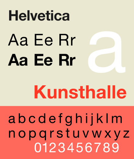
Yet Walters cites another designer seeing Helvetica as “representing the industrial-military complex that her generation rebelled against at the time of the Vietnam War.”
Heady talk indeed for simple little squggly images.
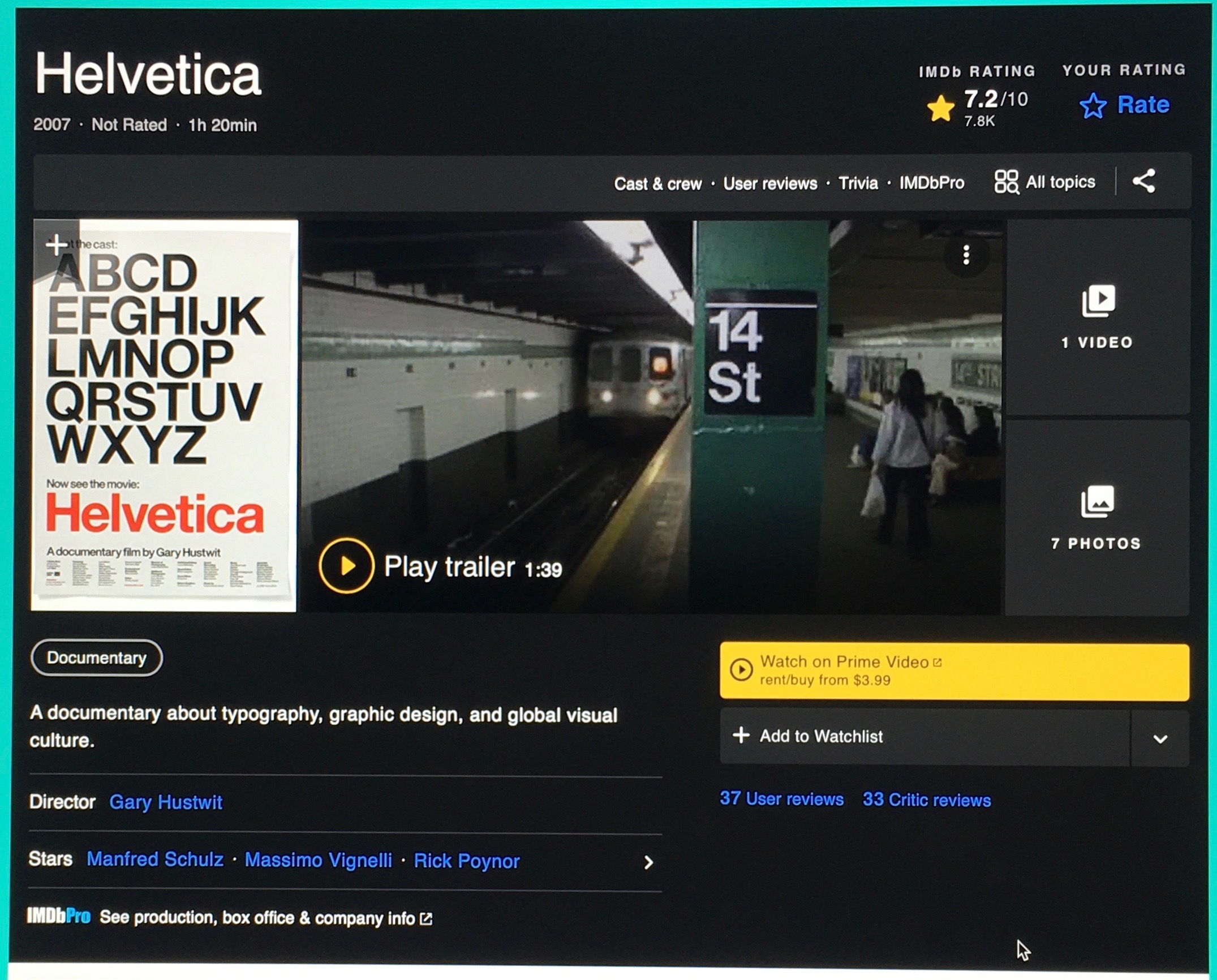
Helvetica, the Documentary. Helvetica is the only typeface I know with its own movie. In 2007, Gary Hustwit made the documentary Helvetica celebrating this typeface’s 50th anniversary. Says Wikipedia, this indie flick is “a history of this typeface interspersed with candid interviews with leading graphic and type designers…. It also explores the rift between modernists and postmodernists, with the latter explaining their criticisms of the famous typeface.”
In This Corner, Wearing Blue Jeans, Helvetica; In This Corner Wearing Funny Trunks, Comic Sans. So what’s wrong with Comic Sans? Its typographical faults are well characterized by @kadavy in “Why You Hate Comic Sans.“

Briefly, this typeface offends some graphic designers in the same way a Cockney accent might distress a BBC enunciator.
For example, @kadavy notes that Comic Sans is unmodulated; that is, its strokes are of uniform thickness. This may sound like artsy nit-picking, but indeed it affects the aesthetics of letters.
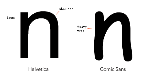
What’s more, Comic Sans has poor letter fit: @kadavy says that combinations of certain Comic Sans characters defy proper “kerning,” the minute spacing artfully placed between letters.

The Wrong Place at the Wrong Time. “So,” @kadavy says, “the story of Comic Sans is not that of a really terrible font, but rather of a mediocre font, used incorrectly on a massive scale.”
I’d agree with this. Indeed, there’s irony in its inappropriate uses: In particular, avoid Comic Sans in notices of automotive recalls, hurricanes, or obituaries.
Where I Like Comic Sans. Back when I spoke at technical meetings, I found Comic Sans a perfect counterpoint to the guy who puts up a visual of minuscule detail and says “We’ve got a lot to cover, so….”
Comic Sans is eminently legible and anything but seriously dull. I like to think it goes well accompanying my love of technicalities.
Reconciliation. Vincent Connare, the inventor of Comic Sans, admitted, “If you love Comic Sans you don’t know much about typography; and if you hate Comic Sans you need a new hobby.”
Like I said, it’s time for reconciliation. ds
© Dennis Simanaitis, SimanaitisSays.com, 2021

I was hoping you would mention a readability study that a couple of my instructors mentioned. Then when two publishers I deal with cited the study as well … but I haven’t actually found such a study.
These wordsmithing professionals referenced a study that claims fonts with serifs are easier on the eyes, enable more rapid reading, and/or are less likely to be mis-read. With degrees in business, technology and history, I hadn’t found such a research project.
Any elaboration?
Nor did I encounter such comments, though I confess to prefer the cleanliness (some might say “starkness”) of sans serif. Some serif styles appear post-Teutonic to my eye.
As a minimally formally trained wannabe occasional designer, I love both these faces! And I agree wholeheartedly with Comic Sans’ designer. After all, it was intended to mimic or at least emulate the handwritten text in the speech balloons in comic books.
It is eminently readable, despite occasional kerning issues. Certainly more readable than the thousands of contemporary post-post modern tortured letterforms foisted upon us by would-be punk-rockers or metalheads or post-rappers or hip hoppers or whatever the musical sensibilities are that seem to influence current design motifs. Street tag gets and graffiti artists seem to have their input as well.
Besides the mostly wild and often unnecessarily complicated fonts, graphic design in general seems to have suffered from contrarian attitudes that throw out basics like simplification and readability of lettering of one color against another color background.
Hello, photowrite,
Thanks for your comments. I sensed these designer trends in researching the item.