
Simanaitis Says
On cars, old, new and future; science & technology; vintage airplanes, computer flight simulation of them; Sherlockiana; our English language; travel; and other stuff
A TYPEFACE RECONCILIATION PART 1
IT’S QUITE ENOUGH that we argue about Covid vaccinations, women’s bodies, and batshit crazy politicos. I offer here reconciliation on typefaces, specifically Helvetica versus Comic Sans. My sources for these tidbits, in Parts 1 and 2 today and tomorrow, are two graphic design authorities and my own experience with Powerpoint.
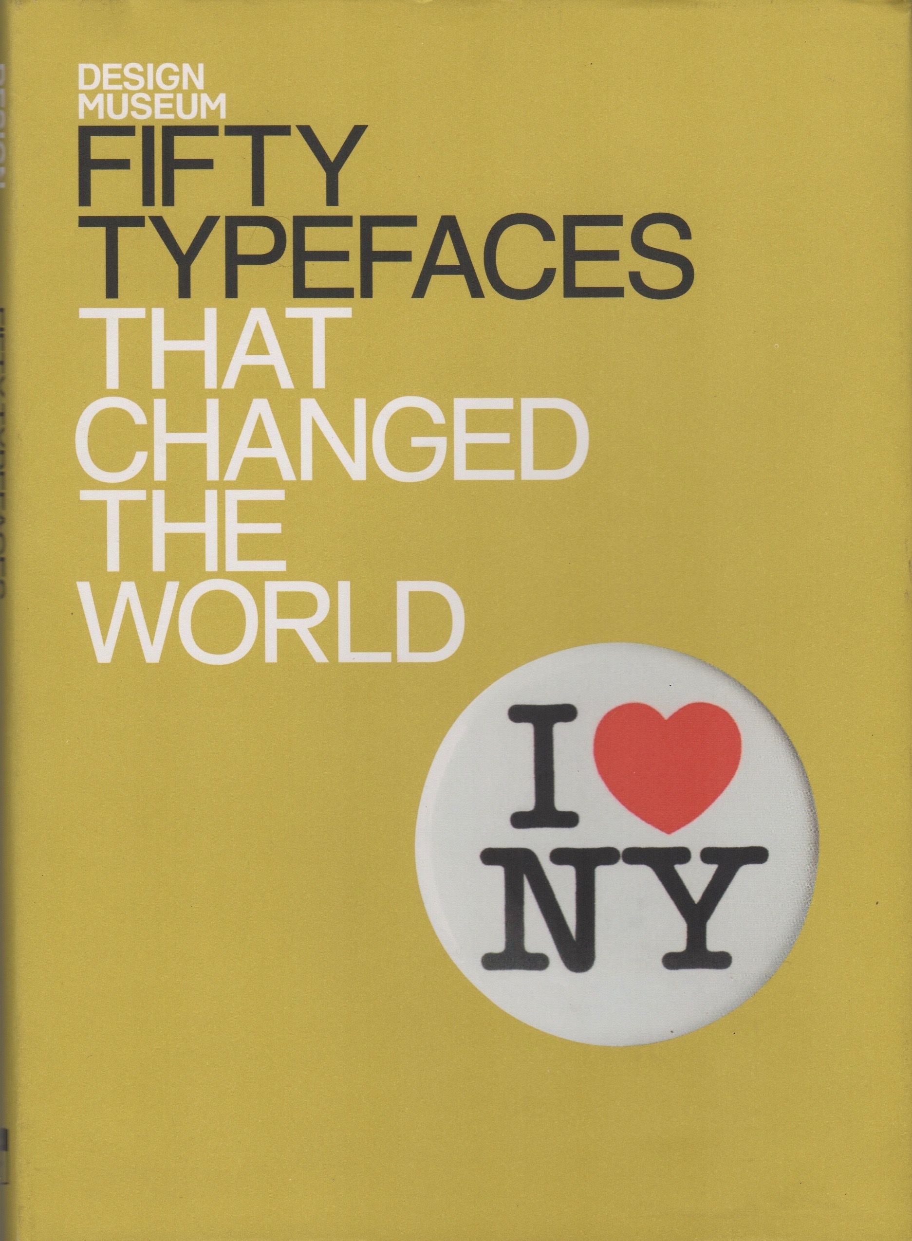
World-Changing Typefaces. John L. Walters is editor of the graphic design magazine Eye. (He was also a founding member of the English synthipop band Landscape, but that’s another story.)
Walters’ book has already made an appearance here at SimanaitisSays in “A Typeface Getting No Respect;” the typeface, a favorite of mine: Comic Sans.
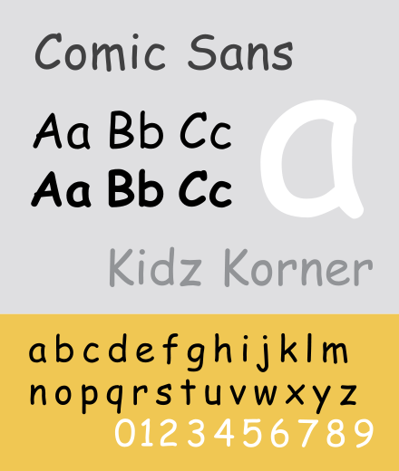
Comic Sans. “In retrospect,” Walters writes, “it seems extraordinary that Vincent Connare’s simple problem-solving type design for a CD-ROM game, commissioned for Microsoft, should have become one of the most overused and most talked-about typefaces, spawning hate sites, ironic applications…, and a legion of jokes. Yet it remains one of the few typefaces that non-designers argue about. Or talk about at all.”
Microsoft Bob. In the mid-90s, Microsoft Bob was to be a user-friendly character interfacing with the company’s Windows products.
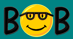
In his beta version, Microsoft Bob spoke in Times New Roman cartoon balloons. This made as much sense as chatting with one’s youngster in legalese.
Instead, Vincent Connare devised a more appropriate typeface, one based on the lettering style of comic books. Ecce Comic Sans.
Connare didn’t complete his project in time for Microsoft Bob, but no matter. Microsoft Bob lasted less than six months, March 10th through August 30th, 1995.
Comic Sans celebrated its 27th birthday last month.
Tomorrow in Part 2, we’re introduced to another of my favorite typefaces, Helvetica. We hear from another design authority who contrasts Comic Sans (unfavorably) with Helvetica. And I come to Comic Sans’ defense. ds
© Dennis Simanaitis, SimanaitisSays.com, 2021

A comic walks into a bar, sans his serifs…
Hi, Richard,
Ba-Dah, Bum. Tish.