
Simanaitis Says
On cars, old, new and future; science & technology; vintage airplanes, computer flight simulation of them; Sherlockiana; our English language; travel; and other stuff
BEOWOLF—A DIGITALLY UNRULY TYPEFACE (FOR A WHILE, THAT IS)
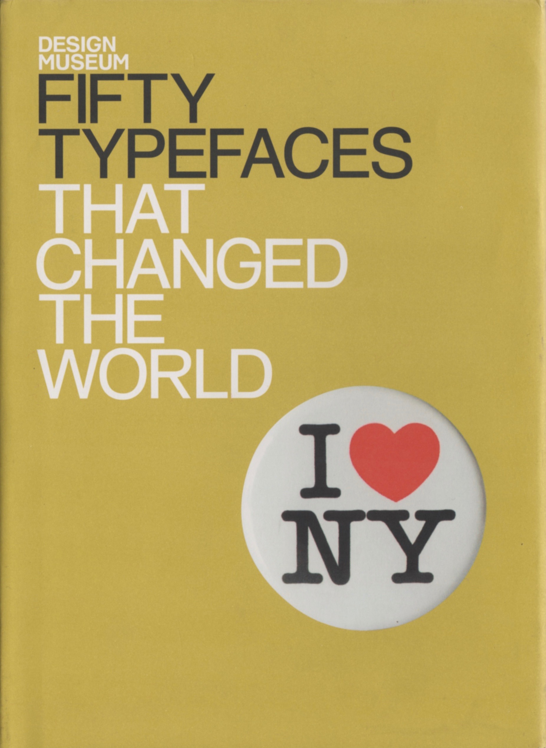
AS DESCRIBED BY John L. Walters in his fascinating Fifty Typefaces That Changed the World, “Few recent typefaces can claim to be as radical—anarchistic, even— as Beowolf….”
Imagine a typeface being purposely inconsistent: “The typographer who sets a word or sentence in Beowolf,” Walters says, “can have no idea what will emerge from the studio’s laser printer. What comes back from another printer, or the repro house, will be something different again—it’s a sorcerer’s apprentice of a typeface, running amok in the operating system of the user’s computer.”
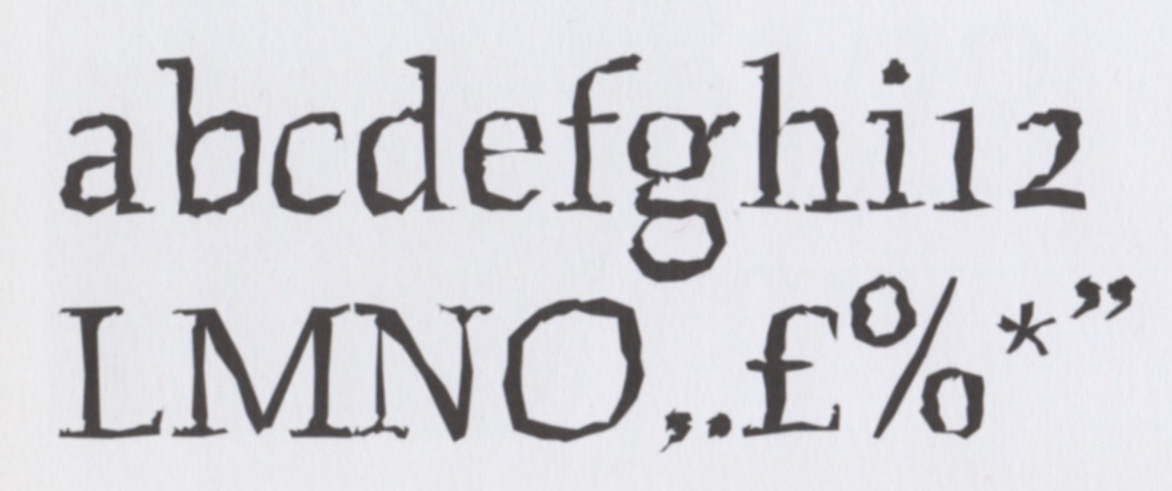
“Distressed” Typefaces. Typographers use the word “distressed” to describe a type style to suggest imperfections of age or unpredictable printing conditions. Walters observes, “LettError’s Beowolf chimes well with the deconstructive and postmodern type and typography of its era.”
Beowolf’s Designers. Just van Rossum (1966–) and Erik van Blokland (1967–) were in their early 20s when, as Walters describes, they “subverted the still-new software PostScript to be deliberately inconsistent.”
To anyone familiar with computer science, being inconsistent is the highest heresy. Digital computers, after all, do nothing more than count on two fingers incredibly quickly—and with incredible consistency.
Beowolf’s designers, though, were able to identify flaws in PostScript that allowed for free-wheeling random modifications. Some of these simulated broken pieces of classic type. Others looked like traditional typewriters’ clogged keys. Still others brought a spooky appearance to the basic Beowolf (that was already a bit eerie).
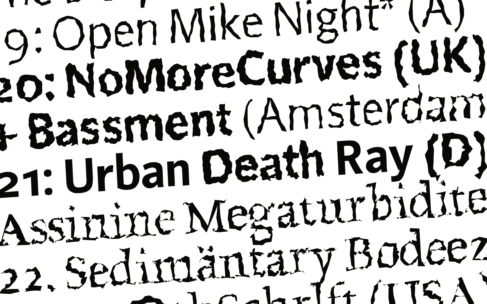
The Designers’ Strategy. The Wikipedia entry about Erik van Blokland suggests Beowolf’s typographical mayhem: “Each time it was printed, code within the typeface files moved the outlines of the letters around slightly, giving it a spiky appearance. The two designers, van Borkland and Just van Rossum, discovered that PostScript 1 format typeface files contained code they could edit directly, adding randomization points to the line positioning points that usually make up such a file.”
“It is thought to be the first dynamically generated typeface,” Wikipedia notes. But not for long.
Smarter Printers to the Fore. Wikipedia says, “The specifications of printer drivers were updated in time to curtail ‘aberrations,’ so in the end Beowulf stopped working. Later versions of the typeface do not include the random feature that made it famous, as current font technology does not support programming features within typefaces, for security reasons.”
Met Recognition. The Metropolitan Museum of Art’s first acquisition of type, in 2011, included Beowolf as one of 23 typefaces. Each was selected as “a milestone in the history of typography.”
A Correction. Walters wrote, “Beowolf, true to its almost-namesake Beowulf, remains an uncaged beast, and in its ingenious subversion of digital code the typeface anticipates the process-driven and interactive design of the twenty-first century.”
Oops. As readers of SimanaitisSays may recall, Beowulf is the hero of the Old English folk-epic poem. The beast is Grendel.
Postmodern Art? Postmodern Music?? Here’s an off-the-wall thought: Could not a digital art file or a music score be subjected to similar randomization? A whole new era of NFTs? ds
© Dennis Simanaitis, SimanaitisSays.com, 2022

Fantastic, Dennis. Thanks!
NFTs sort of by definition are a snapshot. So having a self-modifying NFT would violate the concept. Not to mention a few other rules. But back in the day self-modifying code was in fact a thing (now it’s a bug, if not actual malware). That said, a self-modifying PS font is ingenious – love it, even though it won’t work any more. Thanks for the story!
If anyone is a Fontisaurus, the font ‘3 the hard way’,at least for titles.