
Simanaitis Says
On cars, old, new and future; science & technology; vintage airplanes, computer flight simulation of them; Sherlockiana; our English language; travel; and other stuff
MERCATOR MISUNDERSTANDINGS
IF FLAT-EARTHERS were correct (they aren’t, by the way), life would be a lot easier for cartographers. As noted here at SimanaitisSays, the two-dimensional plane and three-dimensional sphere are not isometric. That is, any planar map of the Earth, no matter how local, will have inherent distortions.
Not that I get all nerdy about map distortions, but an interesting item in The Guardian, March 23, 2017, put this in perspective. Johanna Walters reports, “Boston Public Schools Map Switch Aims to Amend 500 Years of Distortion.”
Walters writes, “In an age of ‘fake news‘ and ‘alternative facts,’ city authorities are confident their new map offers something closer to the geographical truth than that of traditional school maps, and hope it can serve an example to schools across the nation and even the world.”
Here are tidbits on the traditional Mercator map and the Gall-Peters Projection. Check out Wikipedia for a full discussion of the latter, including its controversial sociopolitical aspects.
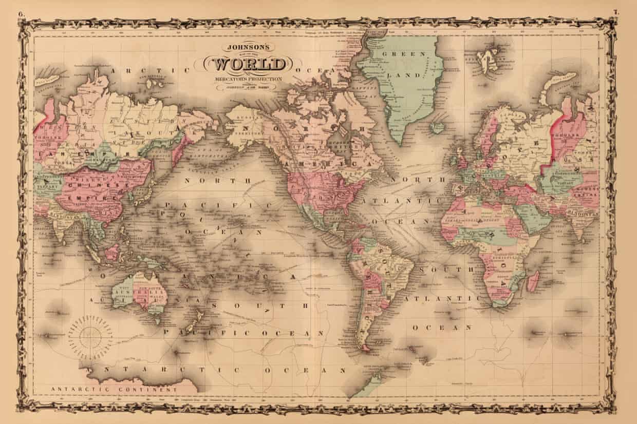
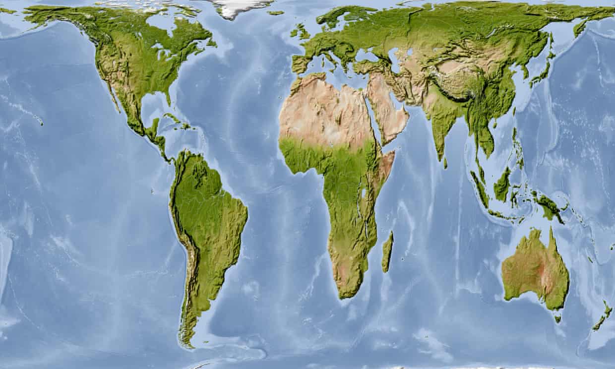
Gerardus Mercator, 1569. It’s astounding that we’re still trusting a world map devised in 1569. I mean, where are the “Here be Dragons” warnings?
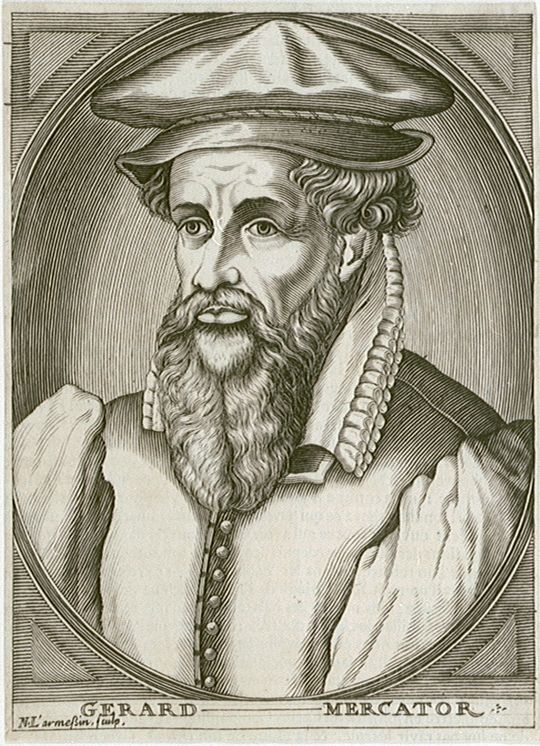
Actually, Mercator was quite the natural philosopher (i.e., scientist) for his day. According to Wikipedia, “He is most renowned for creating the 1569 world map based on a new projection which represented sailing courses of constant bearing (rhumb lines) as straight lines—an innovation that is still employed in nautical charts.”
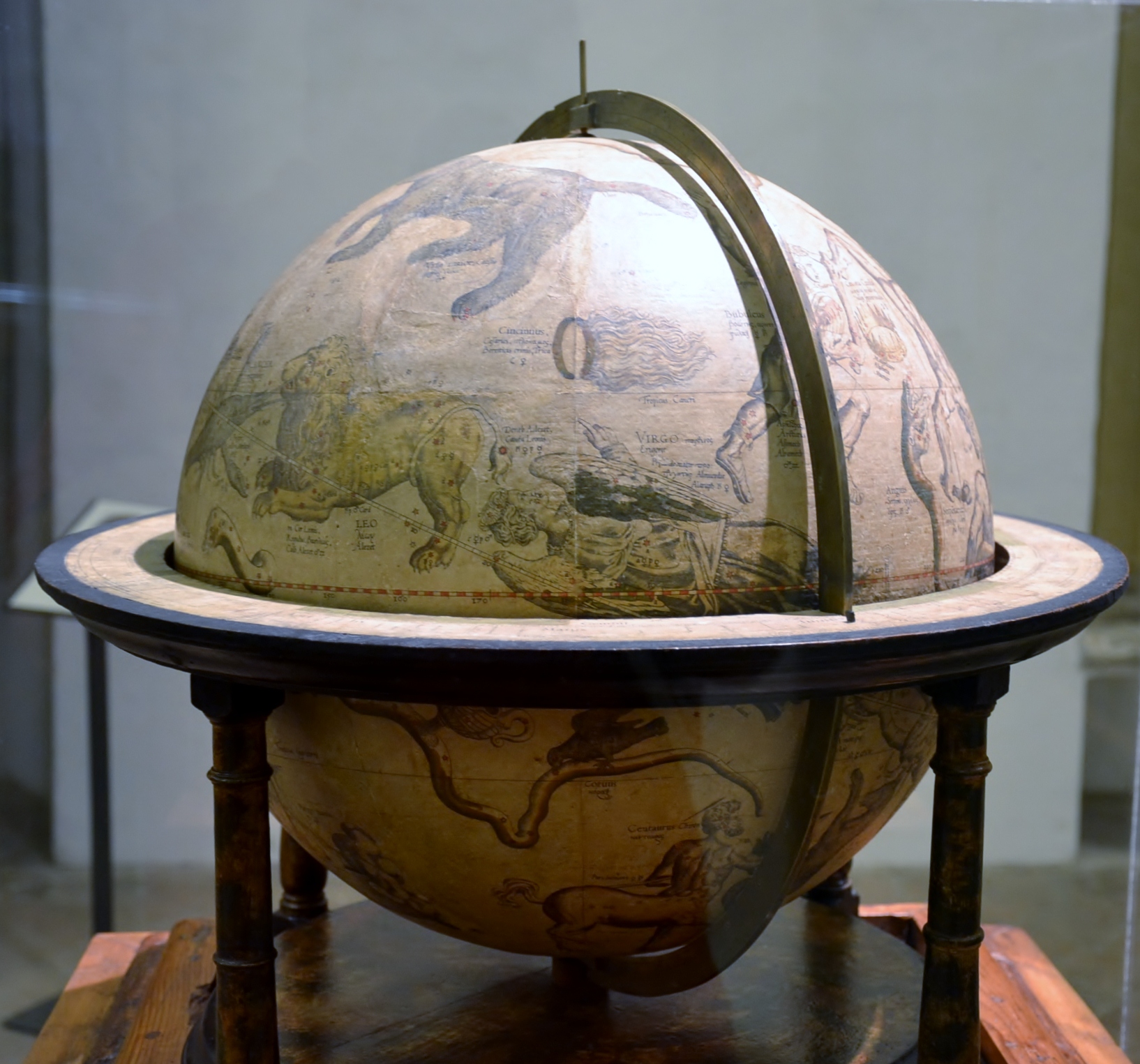
Mercator, Wikipedia notes, also “had interests in theology, philosophy, history, mathematics, and geomagnetism…. A large part of Mercator’s income came from sales of his terrestrial and celestial globes. For sixty years they were considered the finest in the world, and were sold in such great numbers that there are many surviving examples.”
Mercator Projection Misunderstandings. Though the logic of rhumb line projection is well defined, its planar translations leave us with global misunderstandings.
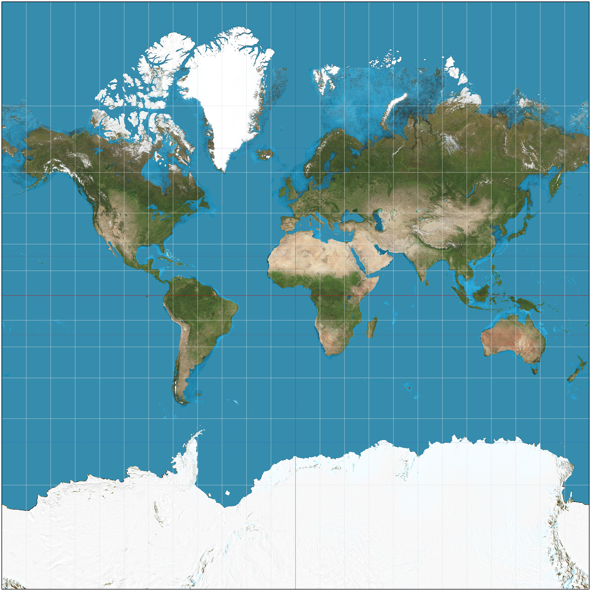
Walters notes, “For example, South America is made to look about the same size as Europe, when in fact it is almost twice as large, and Greenland looks roughly the size of Africa when it is actually about 14 times smaller.”
“Alaska,” Walters continues, “looks bigger than Mexico, and Germany is often right in the middle of the picture, not to the north—because publishers frequently cropped off Antarctica and then re-centered the Mercator map, resulting in the equator appearing two-thirds of the way down the image.”
A Paradigm Shift. Walters writes, “The German historian Arno Peters published his projection in 1974. It matches work by a Scottish 19th-century mapmaker, James Gall, and is also known as the Gall-Peters projection. It is an ‘equal-area’ map, distorting the shape of countries as a two-dimensional visualization of a three-dimensional globe but accurately scaling surface areas.”
Walters notes that individual schools in the U.S. have used Peters maps, but it’s believed Boston is the first public school district to do so.
Gall-Peters Projection Tradeoffs. Bob Abramms is founder of ODT, the exclusive North American publisher of Peters Projection maps. Walters quotes him: “The Peters projection has created a lot of controversy over the years because it distorts shapes, but it’s enormously visually important in terms of the scale and position of the terrain on the Earth, showing correct size and proportion of the continents.”
There are historical and political implications of the two cartographic world views. The Mercator displays colonial expansion of Northern European Christianity. The Peters shows relative size as well as location of the world’s countries and continents.
I like the Boston school idea of installing Peters maps next to Mercator maps, all the better for prompting education through lively discussion. And don’t forget globes, what someone I knew used to call “round atlases.” ds
© Dennis Simanaitis, SimanaitisSays.com, 2021
