
Simanaitis Says
On cars, old, new and future; science & technology; vintage airplanes, computer flight simulation of them; Sherlockiana; our English language; travel; and other stuff
$AVE THROUGH FONT$
ONE OBSERVANT 14-yer-old could save the federal government roughly $234 million a year—by suggesting a standardization of type font. His research made “News of the Week” in the March 14, 2014 issue of Science magazine, published by the American Association for the Advancement of Science. His idea also earned a place in the Journal of Emerging Investigators (http://goo.gl/f0huUS).

Suvir Mirchandani came up with the idea when he was a sixth grader at Dorseyville Middle School in Pittsburgh, Pennsylvania. Switching to Garamond font, he determined, could save his school district nearly $21,000 a year in printing costs.
Then, with the encouragement of editors at the Journal of Emerging Investigators, Suvir broadened his study to the federal government. Garamond again came out as a potential money saver—big time.

Coverage Reduction Percentage by Font. Image from Science, March 14, 2014.
The research article caught my eye for two reasons. First, simply on the basis of its appearance, Garamond has been my word-processor font of choice for years. (I’m using it composing this item.)
Second, the Science article’s lead illustration contrasts Garamond with another favorite of mine, Comic Sans. (Comic Sans is my choice for PowerPoint presentations.)

Design Museum Fifty Typefaces that Changed the World, by John L. Walters, Conran Octopus, 2014. The book is listed at both www.abebooks.com and www.amazon.com.
Garamond, Comic Sans and many others are described in the latest of the Design Museum series of cultural icons. (Others in the series look at handbags, cars, chairs, dresses, bicycles and shoes.) Walters’ choices begin with Blackletter, the “broken script” type of the Gutenberg Bible, and culminate with Ubuntu, an open-source font seen as suitable in more than 200 of the world’s languages.
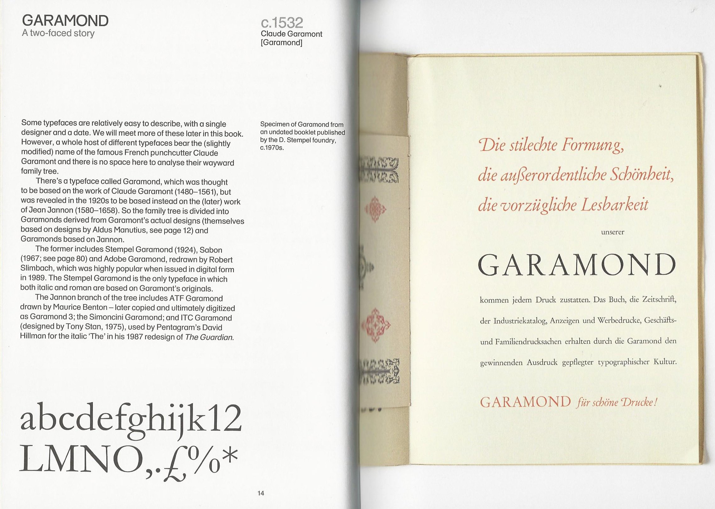
Garamond. This and other images from Design Museum Fifty Typefaces that Changed the World.
Garamond gets its name from Claude Garamont (1480 – 1561), a Frenchman working in the art of designing typefaces about 80 years after Johannes Gutenberg published his bible (c. 1455). The font’s family tree is a complex one, with digitized forms still evolving.

Comic Sans, as in “sans serif,” free of embellishments at character corners.
Comic Sans, has a novel origin—and something of a bad rap. It was designed in 1994 by Vincent Connare for Microsoft. Its inspiration was the Microsoft Bob package of children’s software, which had comic speech “bubbles” inappropriately set in staid Times New Roman.
Comic Sans was designed to be friendly, informal and legible—precisely the reasons I choose it for technical presentations.
Walters observes that Comic Sans “remains one of the few typefaces that non-designers argue about. Or talk about at all.”
That Comic Sans is used in signage, shop fronts and computer system fonts doesn’t surprise me. That it somehow spawns hate sites is an example of idle minds having nothing better to do.
Walters’ book is replete in nuggets. Caslon, designed by Englishman William Caslon in 1725, is familiar to us all: Its typeface family was used to print the Declaration of Independence.
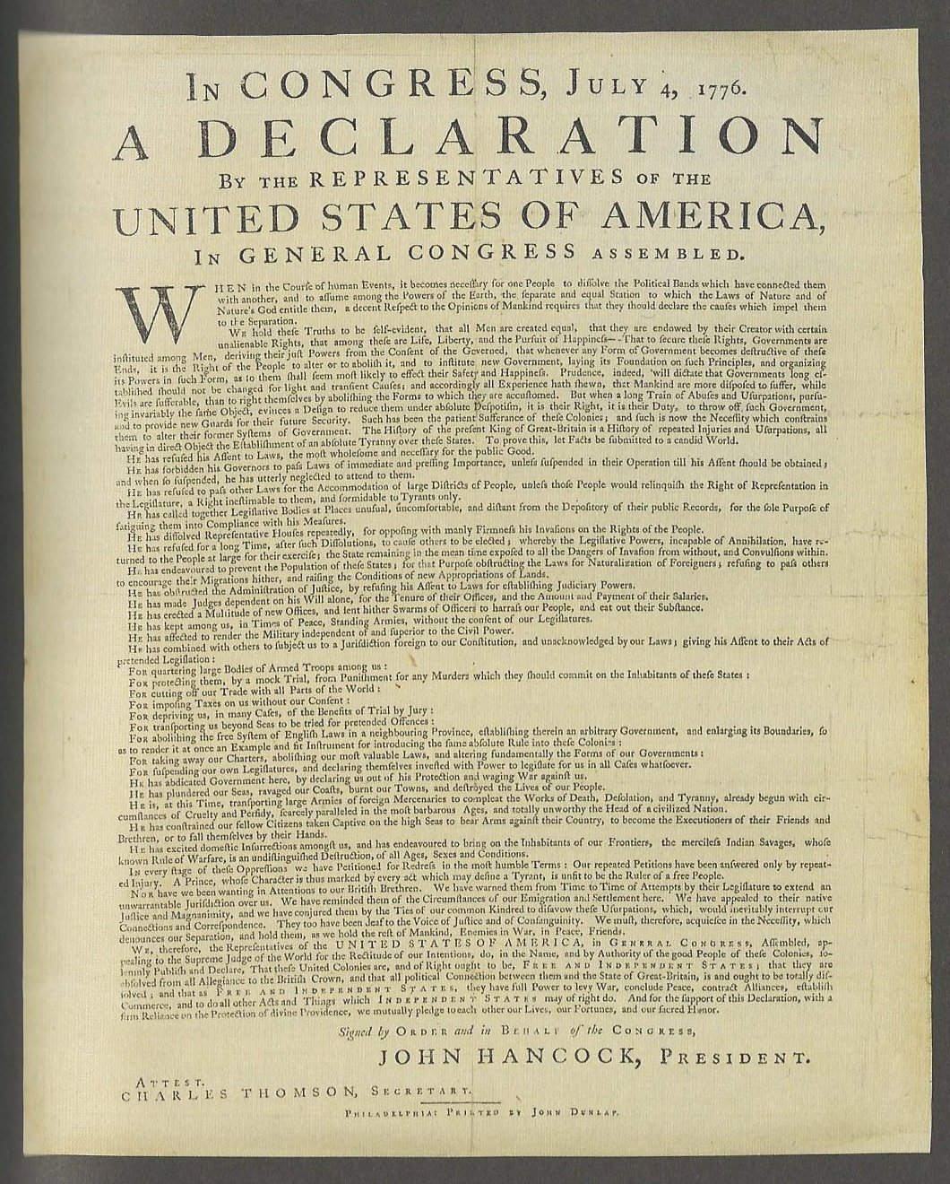
Caslon; a familiar document.
Wood types developed in the early 1800s, largely because of the invention of lateral-router wood-working machinery enabling their mass production.

A wood font can be bold without the type itself being heavy.
Wood type was much lighter than metal; it was a great advance for printers specializing in large-format posters. Though the wood-type business died out with the 19th century, its designs continue. For example, there’s a circus poster reference in the Beatles’ “Being for the Benefit of Mr. Kite.” ds
© Dennis Simanaitis, SimanaitisSays.com, 2014

Isn’t it great that middle-schoolers are watching for the waste at the hundreds of millions level? (A penny saved is a penny earned . . . or even a hundred million?) You wouldn’t want federal bureaucrats involved with such piddling amounts when there’s important work to be done. Anything under ten billion. . . . that’s a rounding error in D.C.
While I agree that anything couched in dollars less than $1E09 is pocket change in the federal government, I also agree that fonts matter. Most federal agencies I’ve dealt with use Times New Roman, with Arial for headings & titles, and they have no concept of the use of styles. Garamond is a little hard to find for free for Windows, though. Also, the suggestion was related to the amount of ink used – ink being more expensive per ounce than perfume. For those of us attempting to read text on a screen, I submit that there may be better alternatives: Garamond is a bit grey and low on contrast. Finally, probably because of that lack of free availability, few people have it on their computers, so defining a print profile for web pages and PDFs that uses it would at best result in conversion to Times New Roman (generic serif).
BTW, I just stumbled across your blog today. Congratulations on finding a way to keep providing people with odds ‘n ends that are amusing, amazing, and informative. The current incarnation of Road & Track (alias C&D?) doesn’t do much of that, which is why my subscription was not renewed despite really lowball offers – can a magazine have negative value? You have been bookmarked.