
Simanaitis Says
On cars, old, new and future; science & technology; vintage airplanes, computer flight simulation of them; Sherlockiana; our English language; travel; and other stuff
UNDERGROUND ART
THERE’S SOMETHING invigorating about public art. And, over the years, the London Underground has been a wonderful venue for its exhibition. London Underground art even generated its own typeface. Here, I share details of an artful book on this topic.
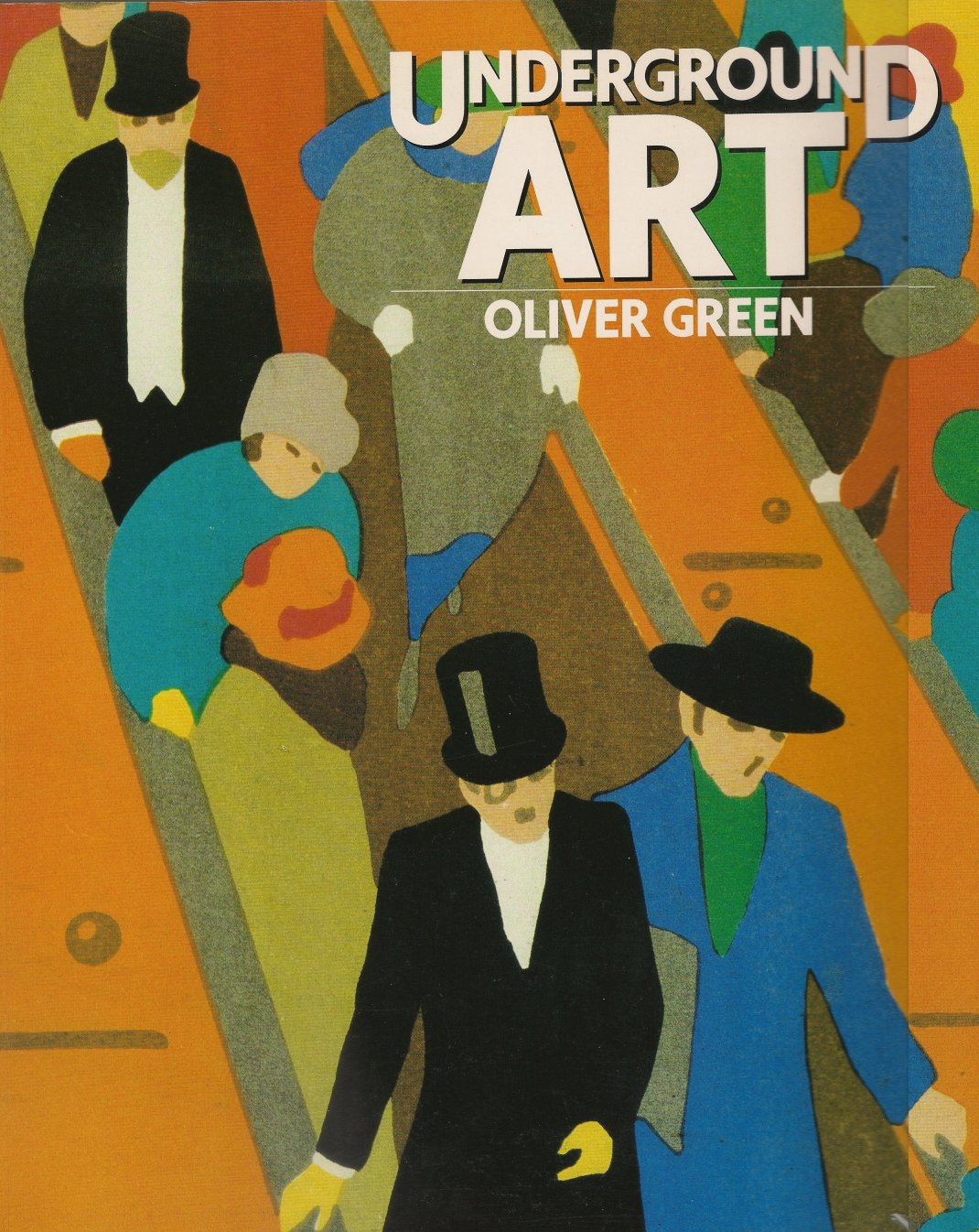
Underground Art: London Transport Posters 1908 to the Present, by Oliver Green, Studio Vista, Cassell Publishers, 1991. It’s listed at www.abebooks.com.
Posters have been part of the London Underground since the early 1900s. From time to time, there have been assigned themes stressing specific destinations or activities.
In 1916, the Underground had a unique typeface designed by Edward Johnson.
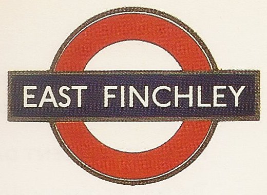
Station identification introduced in 1908 quickly evolved into this familiar style. This and other images from Underground Art.
Proportions of this bold sans serif type were only slightly modified in 1972. Johnson typeface continues in the London Underground to this day.
For more than 80 years, posters for the Underground have been in “double royal” format, 40 x 25 in.

The Way for All, by Alfred France, 1911.
London’s Underground was largely classless, except for first and third class retained on the District Line. “Way for All” became both a direction as well as a slogan suggesting this universal inclusion.

Flying at Hendon, by Tony Sarg, 1913.
Hendon, in north London, hosted an annual aerial derby beginning in 1912. Three million people attended each year, with selected portions of Hendon Aerodrome having exclusivity during the London social season akin to Ascot and Epsom Enclosures.
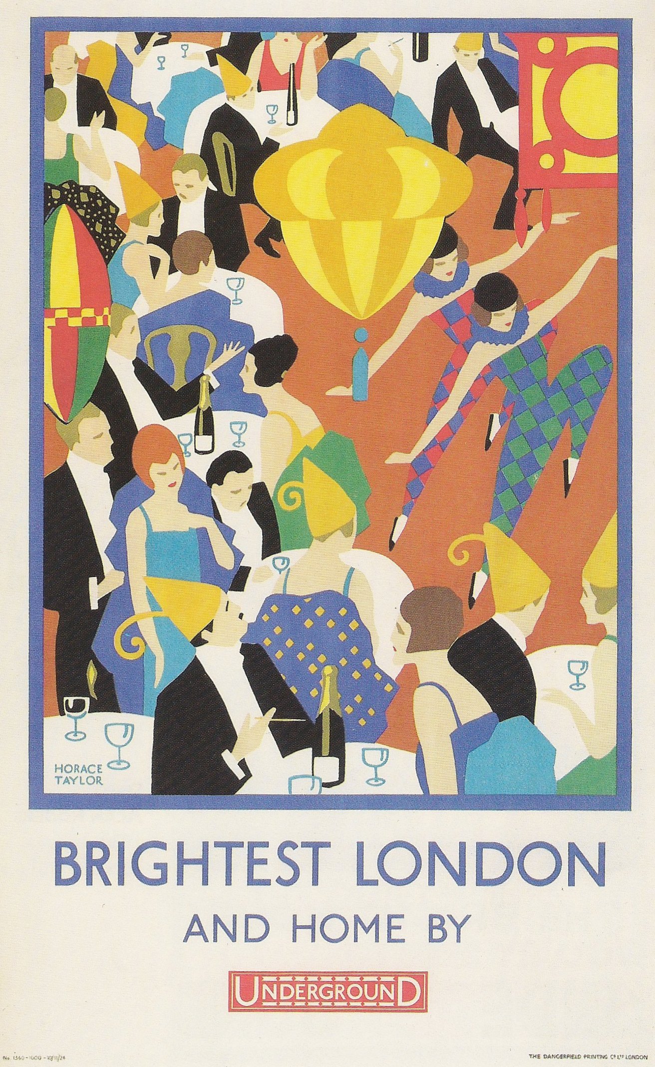
Brightest London, by Horace Taylor, 1924.
Roaring Twenties partygoers had a safe way home. Today, the rest of us get to see how elegant they were.

To Summer Sales, by Horace Taylor, 1926.
A not-so-subtle marketing suggestion appears in this encouragement to go shopping. Horace Taylor was a master of bold poster art.

New Works, by Lightfoot, 1932.
The Underground used a series of New Works posters, with blank portions below the image to overprint details of coming construction. This particular poster by Lightfoot has a 1930s mural style.
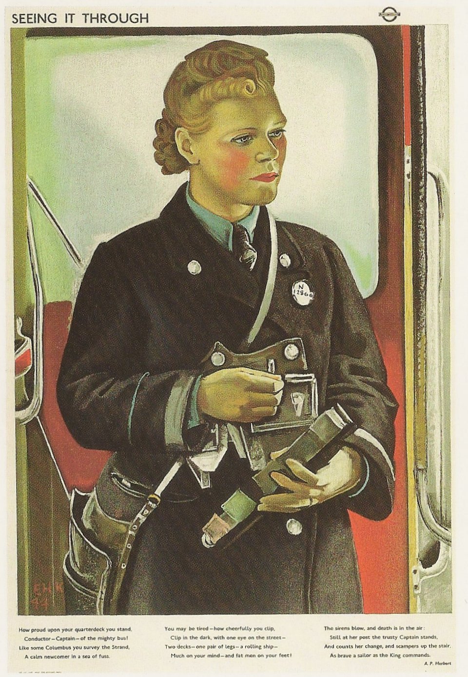
Seeing It Through, by Eric Kennington, 1944.
During World War II, the Underground featured series of posters commemorating the everyday heroism of English workers. Rather than models, Kennington portrayed actual London Transport staff. Mrs. M.J. Morgan worked as a “clippie,” a ticket taker, and saved four children in an air raid by protecting them under the seats of her bus.
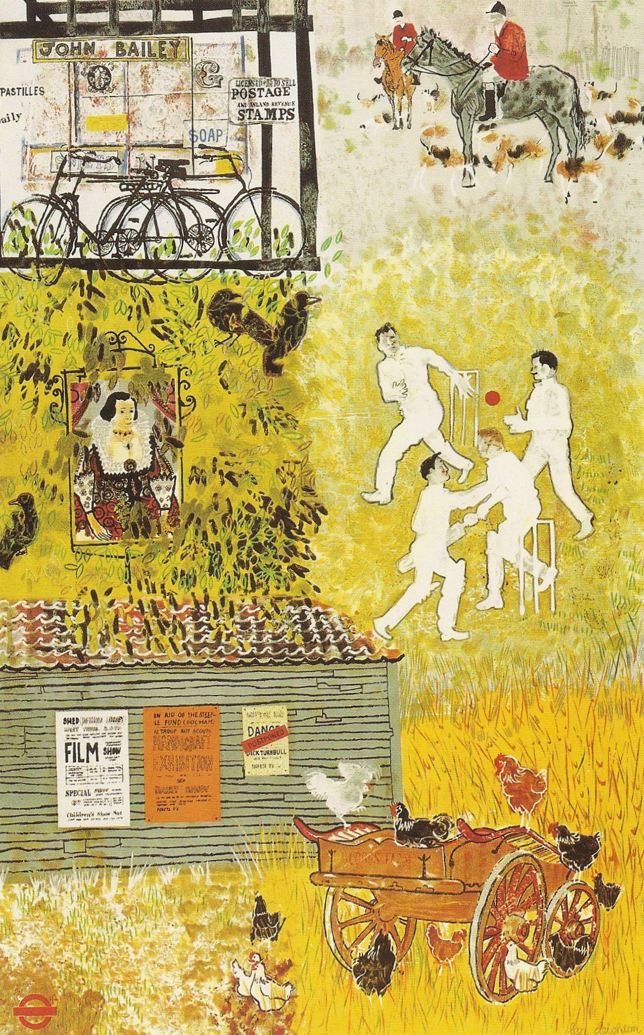
London’s Country Village Life, by Len Deighton, 1957.
Something of a polymath, Len Deighton celebrated nearby village life in this poster art prior to becoming a popular novelist. Among his books are The Ipcress File and, my favorite, Goodbye Mickey Mouse, a historical novel of the 220th Fighter Group, U.S. Eighth Air Force, in World War II England.
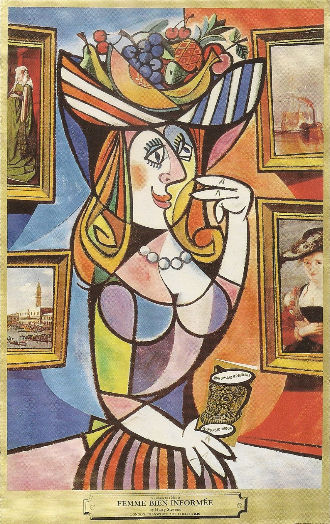
Femme Bien Informée, by Harry Stevens, 1972.
Wit is not overlooked. Harry Stevens Femme Bien Informée carries a “Guide to Museums and Art Galleries in or near London.” The subtitle of the work is “a tribute to the master,” evidently Picasso.
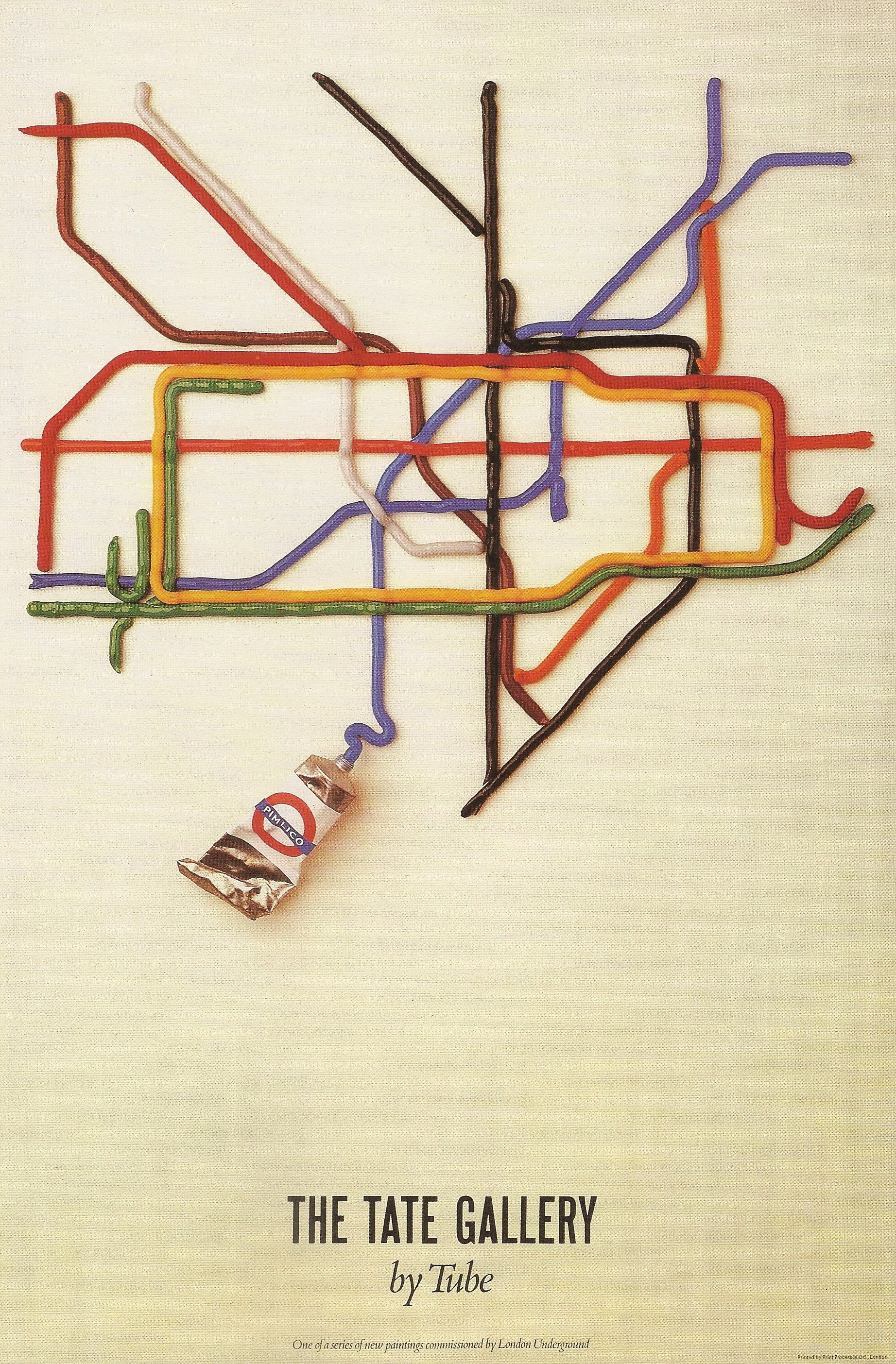
The Tate Gallery, by David Booth (The Fine White Line Design), 1987.
Anyone who’s ever used the iconic map of the London Underground has instant empathy with this David Booth poster, one of the commissions by the Underground during the 1980s. It has also been popular in Underground poster sales.
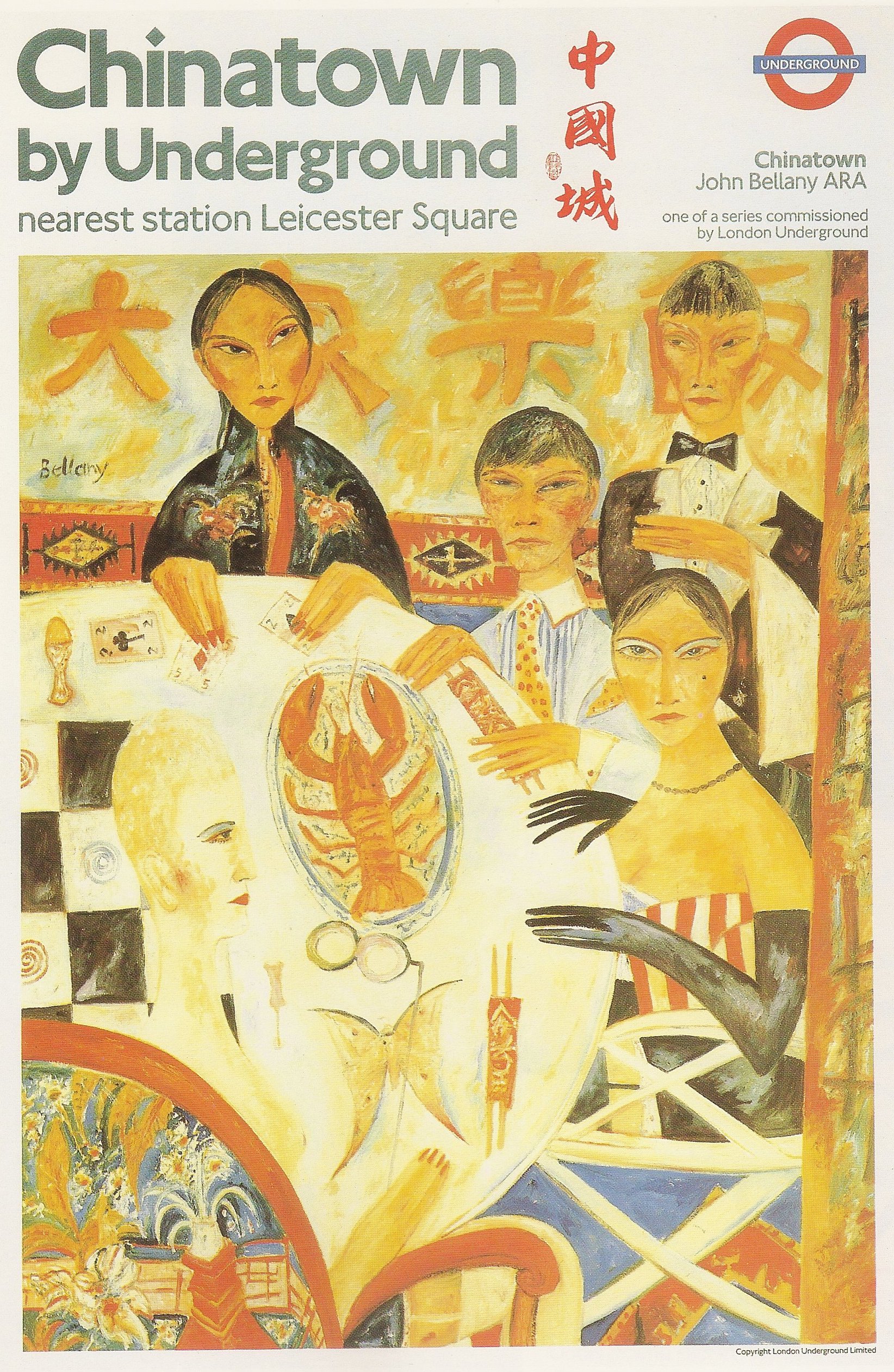
Chinatown, by John Bellany, 1988.
Showing that the Underground doesn’t shun controversy, John Bellany’s Chinatown offers more than the straightforward visual message of a typical poster. Author Green notes that many found the work challenging, mysterious and little disturbing.
Isn’t the best of art challenging, mysterious and a little disturbing, even if it is Underground. ds
© Dennis Simanaitis, SimanaitisSays.com, 2013
