
Simanaitis Says
On cars, old, new and future; science & technology; vintage airplanes, computer flight simulation of them; Sherlockiana; our English language; travel; and other stuff
WANTED, IN THE OLD WEST, AND IN VICTORIAN THEATRE AS WELL PART 1
THESE TIDBITS, IN PARTS 1 AND 2 today and tomorrow, are about Robert Harling’s Playbill typography (which, curiously, has nothing to do with Playbill, the theater magazine described in “Prokofiev, the Soviets, and Playbill” here at SimanaitisSays.) Harling’s Playbill is a relatively recent font, designed in 1938, tracing a heritage back to the 1800s. Its designer is entirely new to me. My initial source was John L. Walters’ Fifty Typefaces That Changed the World, which, in turn, led to my usual Internet sleuthing.
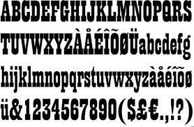
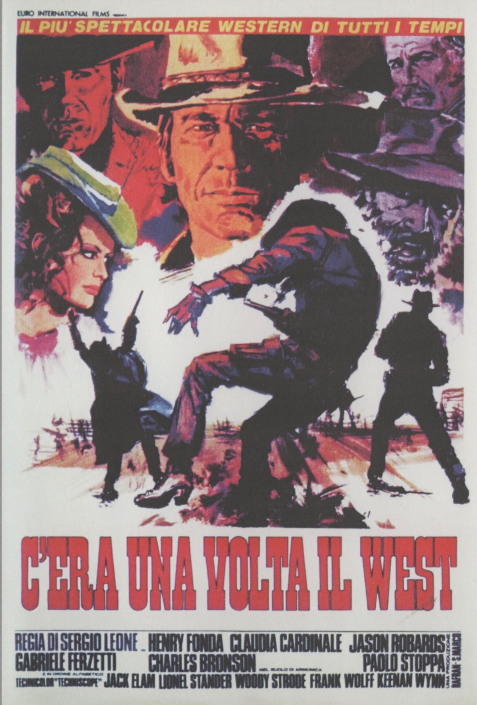
In Fifty Typefaces, John L. Walters describes the Playbill font as evolving from “the forms of theatrical poster wood types—the so-call Antiques—that were popularly used to promote Victorian music-hall events. However, they were also strongly associated with the Wild West—the types used for ‘Wanted’ posters….”
The Font’s Designer. Walters writes, “Robert Harling (1910–2008) is one of those extraordinary people who had several careers—in advertising and design, newspapers and magazines, and as a sailor, a spy and a novelist—but he was also a considerable self-mythologizer.”
Hmm…. This calls tantalizingly for research.
A Mini-Bio. Typographer, ad man, designer, editor, sailor, spy, novelist….
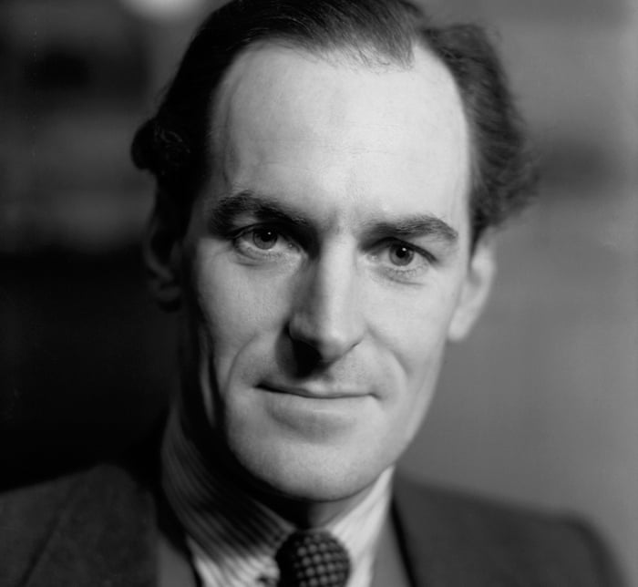
Wikipedia tells of a London-born lad having been orphaned at an early age, raised in Brighton, coming to love its architecture and the sea, then returning to London to enroll in Owen’s School, one of the oldest in the U.K. Other sources, including his obit reported in The Guardian, July 1, 2008, repeat this charming tale.
However, Wikipedia continues, “This was the story he put about. Later research showed this was complete invention. He grew up and went to school in Islington, with a living mother and a father who drove a London taxi. He had a brother and a first wife who, like his parents, had been ruthlessly excised by Harling from his biography, and came as a revelation to his middle-aged children.”
Maybe (says Wikipedia) Harling’s love of typography came from his being given a copy of Pears’ Cyclopaedia on his 12th birthday. Or maybe (see Rose C’est La Vie), he admired the pleasure boats in Brighton and was “fascinated by their names picked out in decorative script.”
Bookshop, Newspaper, Printhouse, Editor, Author. Wikipedia recounts that Harling “briefly kept a bookshop in Lamb’s Conduit Street, and then got a job as a trainee at the Daily Mail, but as he would tell friends later ‘left, quite untrained, a year later.’ Two six-month stints followed at two of the best printers in the country… ‘trying—not all that successfully—to learn more about the technical side of printing.’ This led him to write and publish two books prior to the war: The London Miscellany (1937) and Home: a vignette (1938).
Ian Fleming and Tight Trousers. Harling met Ian Fleming in 1939 when the latter was in Naval Intelligence. Harling, then editor of Typography journal, got involved with design of the Admiralty’s weekly intelligence report.
Another Ian, Ian Jack, wrote in The Guardian, October 10, 2015, “Tight Trousers and Typography: Robert Harling, the Mystery Man Who Could Have Been James Bond.” Ian Jack wrote, “He may or may not have been the model for Ian Fleming’s most famous creation, but Robert Harling was certainly a man of unknowable complications, as his posthumous book about their friendship attests.”
“Of course,” Jack continued, “Bond has as many prototypes as Elvis has lookalikes, and in any case Harling appears more recognisably in The Spy Who Loved Me as the knowledgable printer who knows obscure typefaces. Then again, Harling’s entry in the Dictionary of National Biography rings true when it says that he and Bond shared a ‘sardonic elegance of manner and cool sexual expertise.’ ”
“He was a sprightly man, not tall, with a touch of the dancer in him,” wrote Jack. “He wore a black fedora over silvery hair, thin on top and curling at the sides, and trousers that were astonishingly tight. ‘I don’t know how you make quick getaways in trousers like those,’ his friend Lucian Freud is alleged to have said, bearing angry cuckolds in mind.”
Tomorrow in Part 2, we learn of Harling piloting a Whaler at Dunkirk, editing House & Garden, and living its life to the fullest. And maybe we’ll even get around to his Playbill type font. ds
© Dennis Simanaitis, SimanaitisSays.com, 2022
