
Simanaitis Says
On cars, old, new and future; science & technology; vintage airplanes, computer flight simulation of them; Sherlockiana; our English language; travel; and other stuff
WANTED, IN THE OLD WEST, AND IN VICTORIAN THEATRE AS WELL PART 2
YESTERDAY IN PART 1, we saw British polymath Robert Harling rise (possibly from orphenhood, possibly not) to become a typographer (Playbill font, 1938), an editorial trainee (twice, not for long each time), a printhouse trainee (twice, again, not for long each time), and a published author of two books. Then, with war clouds looming, he hooked up with Ian Fleming in Naval Intelligence. Yes, that Ian Fleming.

And Then Came Dunkirk. As described in The Guardian, July 1, 2008, “A keen weekend sailor, Robert took part in the wartime evacuation of British forces at Dunkirk in May 1940, which he described in his book Amateur Sailor, published in 1944 under the pen name Nicholas Drew. The poet John Masefield praised the book as the best eyewitness account of Dunkirk ever written. Robert then joined the Royal Navy, first serving on mid-Atlantic convoy duty. Again, he gave a marvellous account of this experience in his atmospheric memoir The Steep Atlantick Stream (1946).”
Fleming’s Secret Navy. Ian Fleming brought Harling into Unit 17Z, soon to be known as Fleming’s Secret Navy. “Wartime experiences cemented Robert and Fleming’s mutual admiration, The Guardian reports. “Robert is depicted fondly in The Spy Who Loved Me as the make-up man on the Chelsea Clarion—‘a man called Harling was quite a dab hand at getting the most out of the old-fashioned type faces that were all our steam-age jobbing printers in Pimlico had in stock.’ ”
Post-War Careers. After the war, Harling published typographic journals, was art director of an advertising agency, and became architectural correspondent and then typographic adviser to the Sunday Times, an appointment that continued into the 1980s.
House & Garden Decades. Harling ran Britain’s upmarket House & Garden from 1957 to 1993, when he was well into his 80s. The Guardian notes, “He invented what would soon be known as ‘lifestyle features.’ ”
The Guardian also observes, “Robert, who never got the hang of feminism, ran his office as an amiable harem, extracting his mini-skirted girl assistants one by one for a cappuccino at a nearby coffee bar in Maddox Street.” But also, “He was fanatically loyal to his staff….”
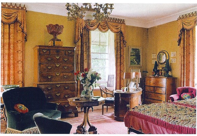
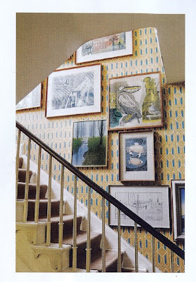
Country Life. Robert and wife Phoebe lived in an eighteenth-century rectory called The Glebe House. In “An English Aesthete and Lover of Regency,” Rose C’est La Vie, April 6, 2009, recounts that they “would generally hold their lively dinner parties midweek because Friday evenings and Saturdays were spent at The Sunday Times both designing the news pages and as architectural correspondent…. Harling must have had extraordinary energy because he was never happier than when he was designing and beautifying houses.”
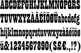
A Typographical Bent. Or happier when designing new fonts: Playbill is his most well known typographical effort, designed in 1938 for Stephenson Blake, a highly regarded type founder established in 1818.
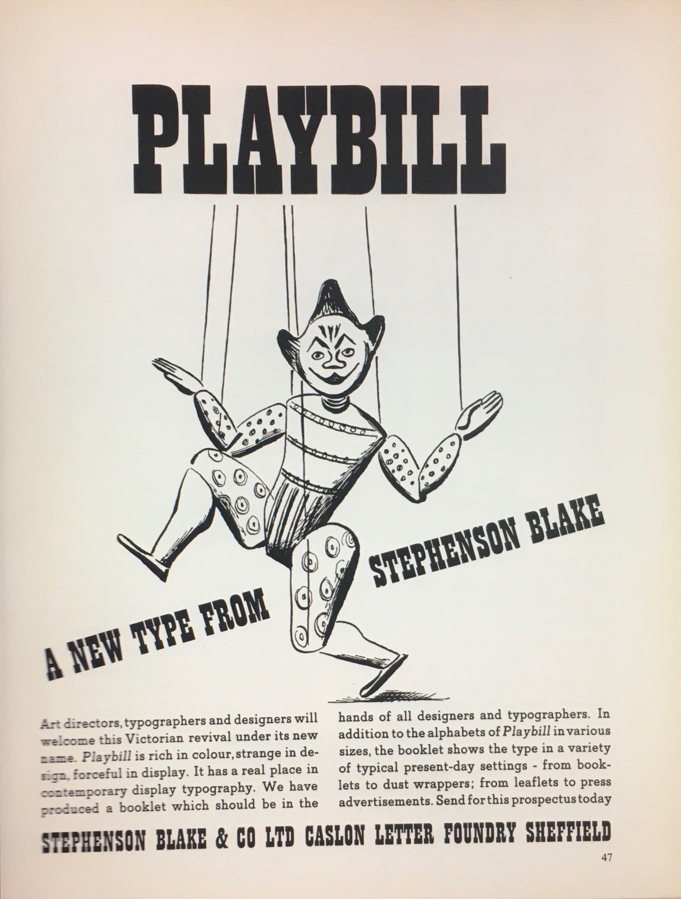
In his book Fifty Typefaces That Changed the World,John L. Walters writes, “Playbill still has an active life in the movie industry, where their exaggerated slab serifs produce what poster collector and academic Paul Rennie calls ‘a distinctive optical dazzle and visual punch.’ ”
Other Typefaces. In 1939,Harling devised Tea Chest, a stencil design inspired by old boxes and industry. Also that year, he designed Chisel, an adaptation of a ‘Latin’ or wedge-serif face.

Mythologizing Himself? Recall from Part 1 my researching Harling’s “self-mythologizing.” Geez, give the guy a break. There’s quite enough that’s documented very well indeed. ds
© Dennis Simanaitis, SimanaitisSays.com, 2022
