
Simanaitis Says
On cars, old, new and future; science & technology; vintage airplanes, computer flight simulation of them; Sherlockiana; our English language; travel; and other stuff
FONTS CAN SAVE TREES
“HARPERCOLLINS MADE A TINY TWEAK to its Book Design—and Has Saved Thousands of Trees as a Result,” reports Elizabeth Segran in the Fast Company website, April 2, 2024. What’s more, readers aren’t likely to notice any difference.

Here are tidbits about this environmental achievement.
The Challenge. Segran writes, “Just ask Leah Carlson-Stanisic, associate director of design at HarperCollins, one of the four biggest publishing houses in the the world. When a manuscript comes across her desk, she considers what font best expresses the content. Historical fiction might warrant a font created in the 1800s. A book about technology might require a more recent sans serif. ‘It’s 30% experience and 70% intuition,’ she says.”
I’m reminded of my personal quirk of preferring Comic Sans Serif, a sometimes maligned font, for my technical Powerpoint presentations because of its… well, comic informality and easy readability. I needn’t care about saving paper, but a huge publishing house surely does.
Segran notes, “… over the past three years, HarperCollins’s designers have put their skills toward a new mission: saving paper. In an effort to reduce the carbon footprint of each book, they’re tweaking fonts, layout, and even the ink used. The goal is to pack more into each page, while ensuring that the pages are as readable as ever. And so far, these subtle, imperceptible tweaks have saved 245.6 million pages, equivalent to 5,618 trees.”
Saving More Than 350 Pages per Bible. Segran offers details: “HarperCollins’s Christian publishing division, Zondervan Bibles, first came up with the idea of using design to save paper. Bibles have historically used upwards of 2,500 pages. In 2015, Zondervan’s designers determined that if they used different fonts and adjusted the page layout, they could reduce the number of sheets used. It would also cut HarperCollins’s printing costs.”
Segran continues, “They developed a new compact typeface called the NIV Comfort Print. Ultimately, it saved more than 350 pages per bible, resulting in a total savings of 100 million pages in 2017. Stacked up, that would be the equivalent to four times the height of the Empire State Building.”
Seeking Optimal Fonts. Segran describes the company’s identifying fonts for other kinds of books: “HarperCollins uses a wide range of off-the-shelf fonts in its books, rather than custom ones. As the team ran the experiments, they observed that some fonts were more compact, resulting in fewer total pages, while remaining easy to read. So they curated a list of 15 fonts they determined are the most eco-friendly, which will be the preferred fonts from now on.”
Proof in Readability. “In the end,” Segran says, “the designers found that clever font selection, coupled with a thoughtful layout design that reduced white space, resulted in more words per page. For instance, in one example, the same text set to Garamond Pro resulted in many more words on the page compared to Bembo. Both fonts are fairly similar, with a classic serif look. And when you place them side by side, the differences are imperceptible.”
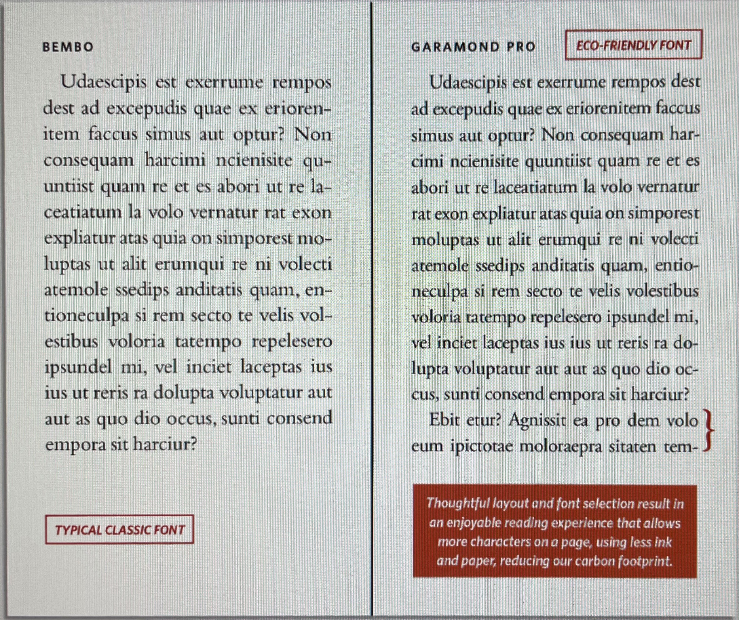
A test of Garamond Pro and Bembo.
I sense only the slightest reduction in spacing and font thickness, but no loss of readability.
Fun with Google Translate. By the way, recalling our old friend “Lorem Upsum,” I fed the first sentence of this test page to Google Translate and got this Latin/English rendering: “Do you want to use a knife to get rid of what we are made of?”
Hmm… Reversing the process got me “Visne cultro carere quod confirimur?” Reversing yet again got me “Do you want to get rid of the knife that we are imprisoning?”
Do I sense some A.I. hallucinating here?
Back to HarperCollins. Segran notes, “But there were also many complexities in the process. For instance, they had to consider the heaviness of the font. One font they used frequently is Bodoni, which was first created in 1798, and appears frequently in HarperCollins books.”
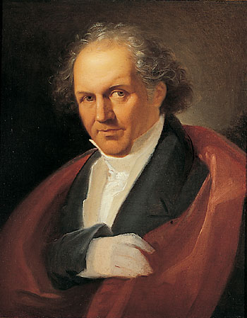
Giambattista Bodoni, 1740-1813, Italian typographer, compositor, printer and publisher. Portrait by Giuseppe Lucatelli from Wikipedia.
“As a very heavy font,” Segran continues, “they realized they could fit more words on a page, while keeping it readable. But they also found that with very large letters, like subheadings, the ink would bleed through the paper, making it hard to read the words on the next page.”
A byproduct of avoiding this “bleedthrough” was identifying fonts that use less ink—another cost savings.
“Still,” Segran observes, “there is complex math involved with cutting pages from books. Printers produce very large sheets, which are then cut and folded into what ultimately becomes segments of 16 pages. When trying to cut pages from the book, designers need to be able to remove multiples of 16 pages.”
Interesting. Those working at the machine level of computer science think in hexadecimals too. ds
© Dennis Simanaitis, SimanaitisSays.com, 2024

A co-worker once got an internal award for shrinking the size (in pages) of an environmental document, shortly after we converted to using Macs rather than PCs (in the DOS era). Mostly, he just shrank all the type (10 point or even smaller!) and squeezed it together, combined with going to 2 columns/page. But he did (as did the rest of us after that) fiddle with the weight of the font and alternative fonts (I think Garamond did come into play). Overall, it did not make the document easier to read, but perhaps that was the intent…