
Simanaitis Says
On cars, old, new and future; science & technology; vintage airplanes, computer flight simulation of them; Sherlockiana; our English language; travel; and other stuff
TYPE CASTING
TYPOGRAPHY IS an art form, the design of letters, numerals, punctuation marks and other characters and how they fit together. And to paraphrase an old chestnut, “I don’t know much about typography, but I know what I like.”
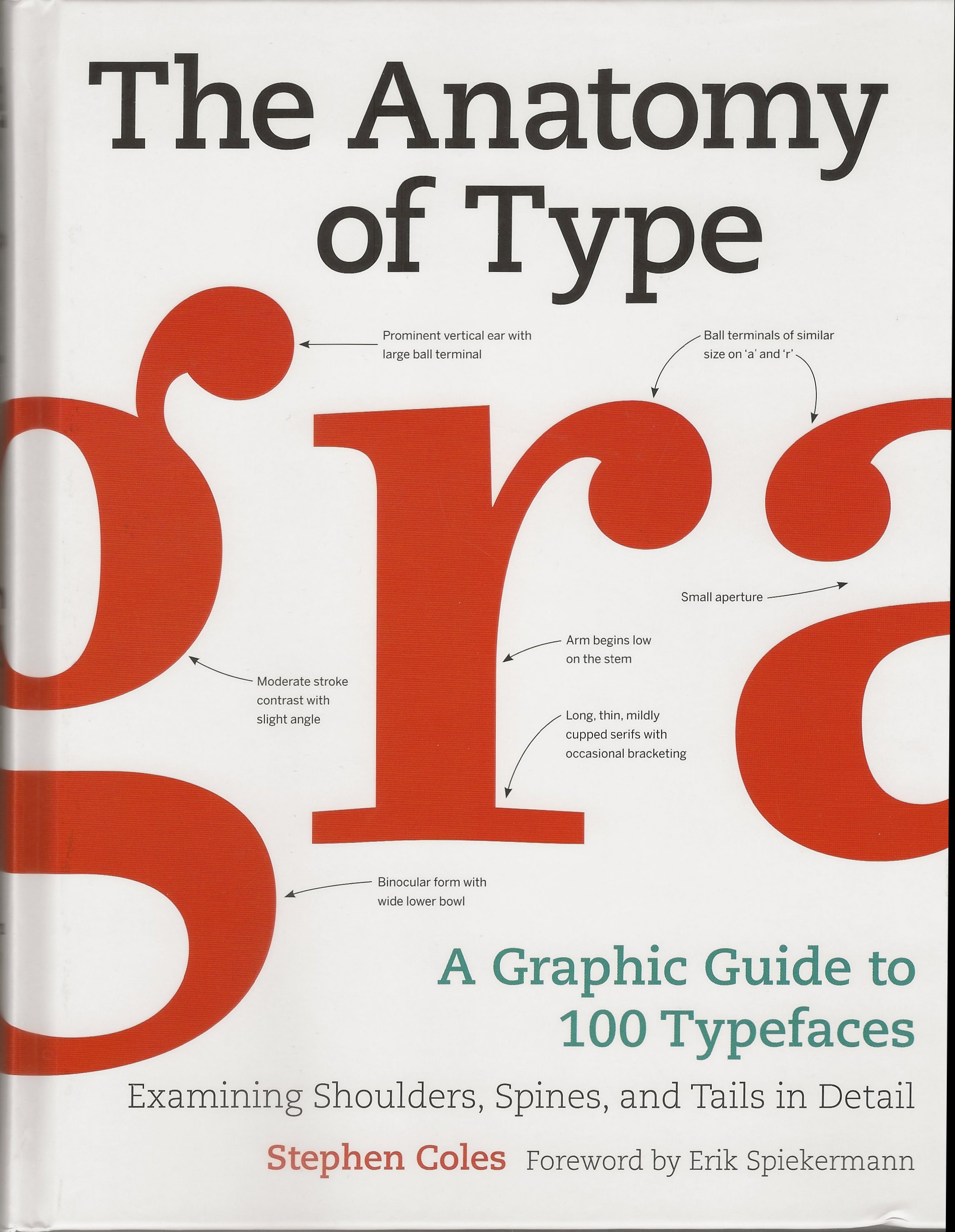
The Anatomy of Type: A Graphic Guide to 100 Typefaces, Examining Shoulders, Spins, and Tails in Detail, by Stephen Coles, foreward by Erik Spiekermann, Harper Design, 2012. Both www.amazon.com and www.abebooks.com list it.
What’s more, because of Stephen Coles’ book, The Anatomy of Type, I’m learning why I like the typefaces with which I choose to spend time.
The website you are now reading is an example. Its Premium Suburban template is one of many offered by WordPress (the .wp. jazz in citing earlier items). From a selection of typefaces, I chose Le Monde Sans for the Simanaitis Says head and Museo Slab for the rest. [Late add: My iPhone, however, seems to present everything in a typeface that sure looks like Arial (see illustration below).]
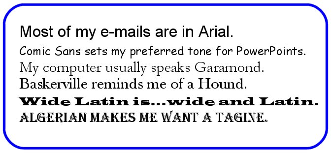
By contrast, when composing on my computer, I use Garamond typeface. It’s one of many choices ranging from Algerian to Wide Latin. Other more familiar typefaces are Arial (which I like for email), Baskerville (used occasionally because of my Sherlockian leanings) and Comic Sans (which I find light and readable for PowerPoint presentations).
Typefaces themselves can convey thoughts.
Coles’ book offers more than a mere listing of typefaces. There’s a Glossary of Typographic Terminology, Type Classification at a Glance, Key Classification Features and other analytical tools.
There’s the familiar dichotomy of Serif (having little foots at the end of many strokes, as seen here in Museo Slab) versus Sans (short for Sans Serif, free of sarifs, as seen in the website’s Le Monde Sans head).
Be aware too that specialists make a distinction between “typeface” and “font.” A font collects different graphical representations of a character: lower-case, upper-case, Roman, Italic, etc. A typeface is the design of a particular set of characters.
A new one for me is the distinction between Humanist (derived from handwritten strokes) versus Rational (using shapes that are drawn as opposed to written).
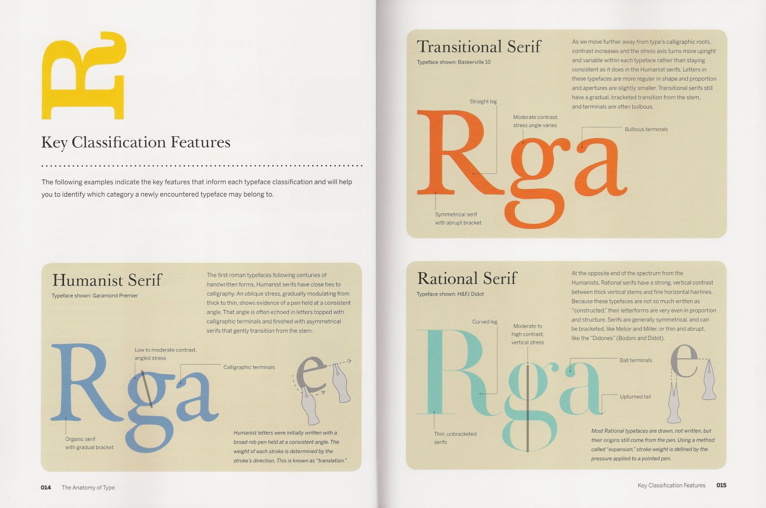
Three Serif examples, Humanist, Transitional and Rational. This and images following from Anatomy of Type.
Humanist typefaces display their calligraphic influences. At the other extreme, Rational typefaces are not so much written as “constructed.”
By the way, Coles chooses a member of the Baskerville family for his heads and Benton Sans for the book’s text. He notes that Baskerville is a Transitional Serif typeface; Benton Sans, a Gothic Sans one.
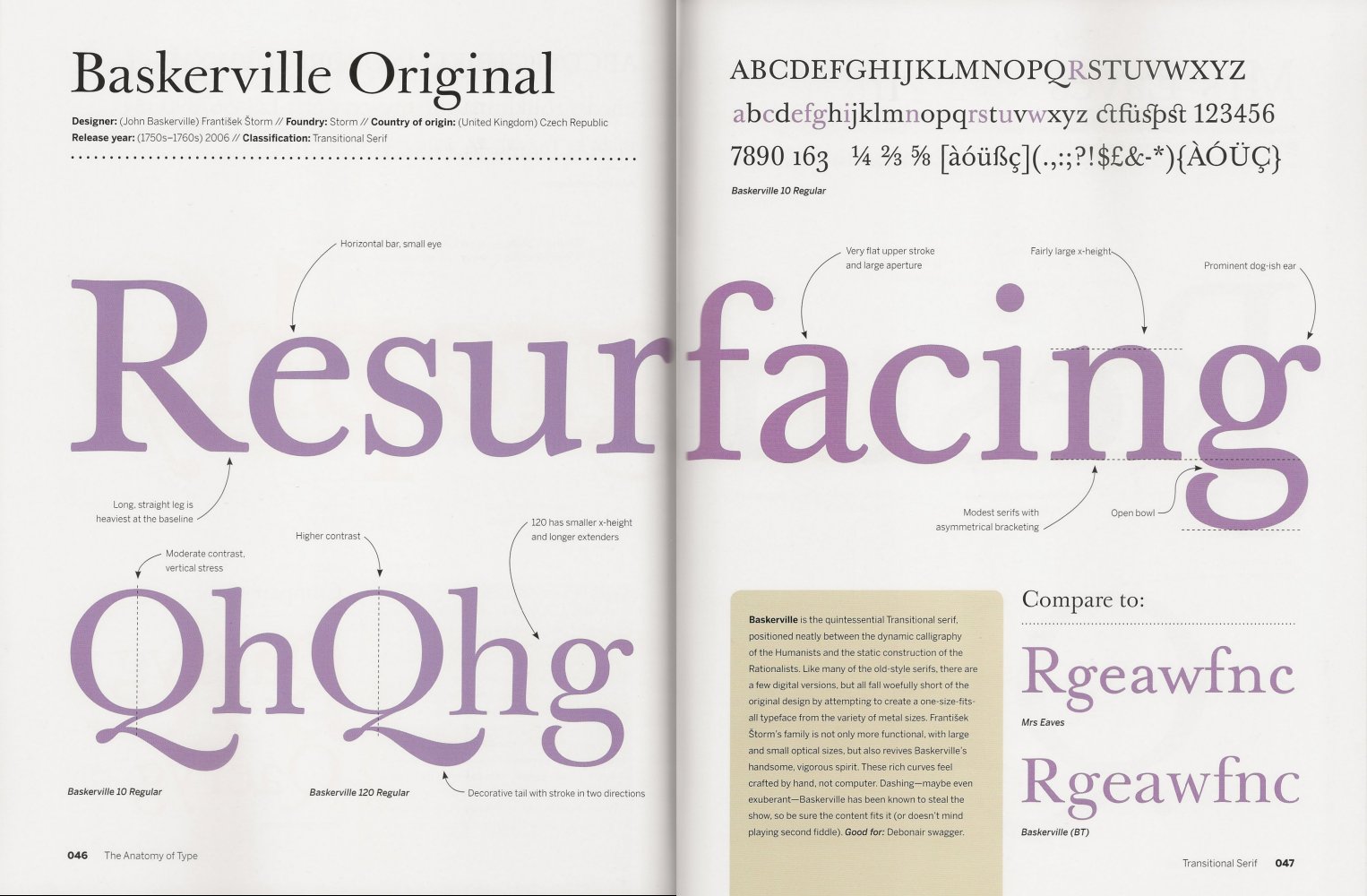
Details of Baskerville Original.
Coles notes that “Baskerville has been known to steal the show, so be sure the content fits it (or doesn’t mind playing second fiddle.” Thus, he limits it to heads, not text.
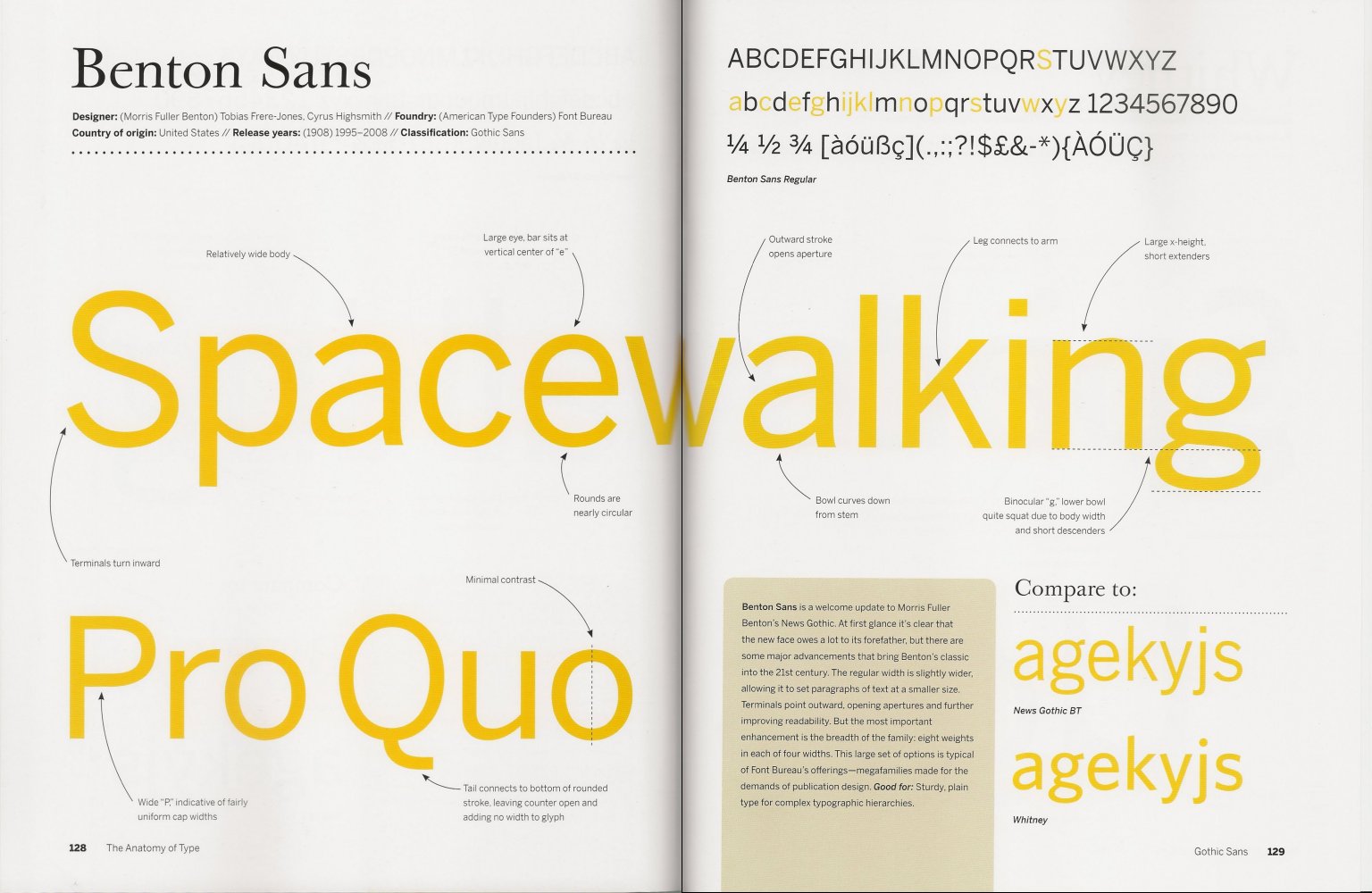
Details of Benton Sans.
Benton Sans’ heritage as a Gothic typeface is a complex one. When introduced in the early 1800s, Sans Serif typefaces were considered “grotesque.” The Grotesque/German: Grotesk nickname stuck, with some English and American variations gaining the name Gothic.
Coles observes that Benton Sans’ “most important enhancement is the breadth of the family: eight weights in each of four widths.”
I know families like that too. Don’t you? ds
© Dennis Simanaitis, SimanaitisSays.com, 2013
