
Simanaitis Says
On cars, old, new and future; science & technology; vintage airplanes, computer flight simulation of them; Sherlockiana; our English language; travel; and other stuff
THE ROARING—AND SOARING—TWENTIES PART 1
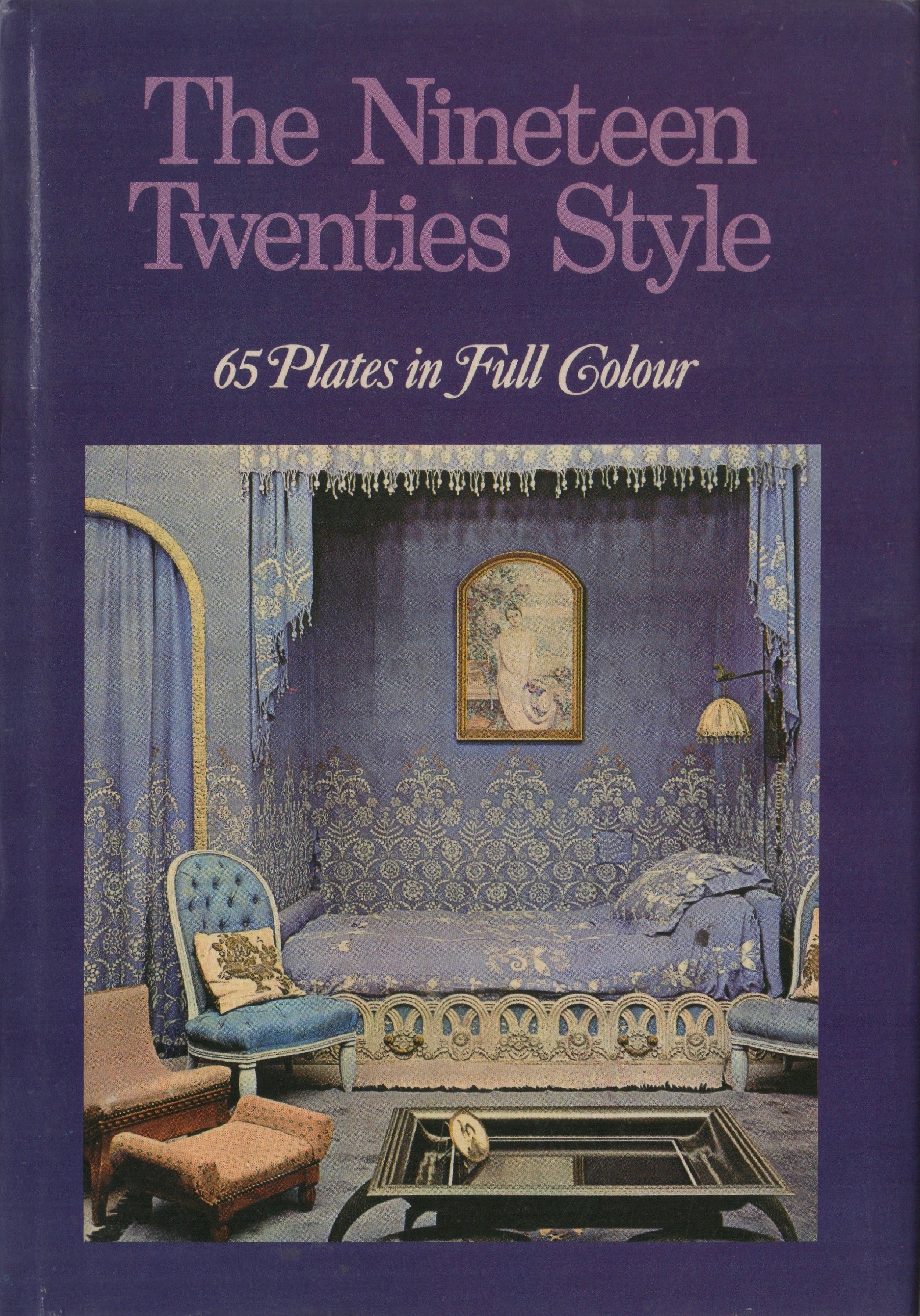
DESIGN OF THE NINETEEN-TWENTIES soared. Artists and artisans, weary of World War I, responded with new perceptions of reality, some of them outright bizarre. Here, in Parts 1 and 2 today and tomorrow, are tidbits from The Nineteen Twenties Style.
Yvonne Brunhammer wrote in 1966, “The 20th century is one of accelerated change, with the result that the inter-war period already seems remote. A few years ago it seemed possible to define the style of the 1920s in a few words, and only recently has it begun to be interpreted in a less limited and conventional manner.”
Art at the Ballet. Two of my favorite examples evolved from ballet, both with music of Darius Milhaud.
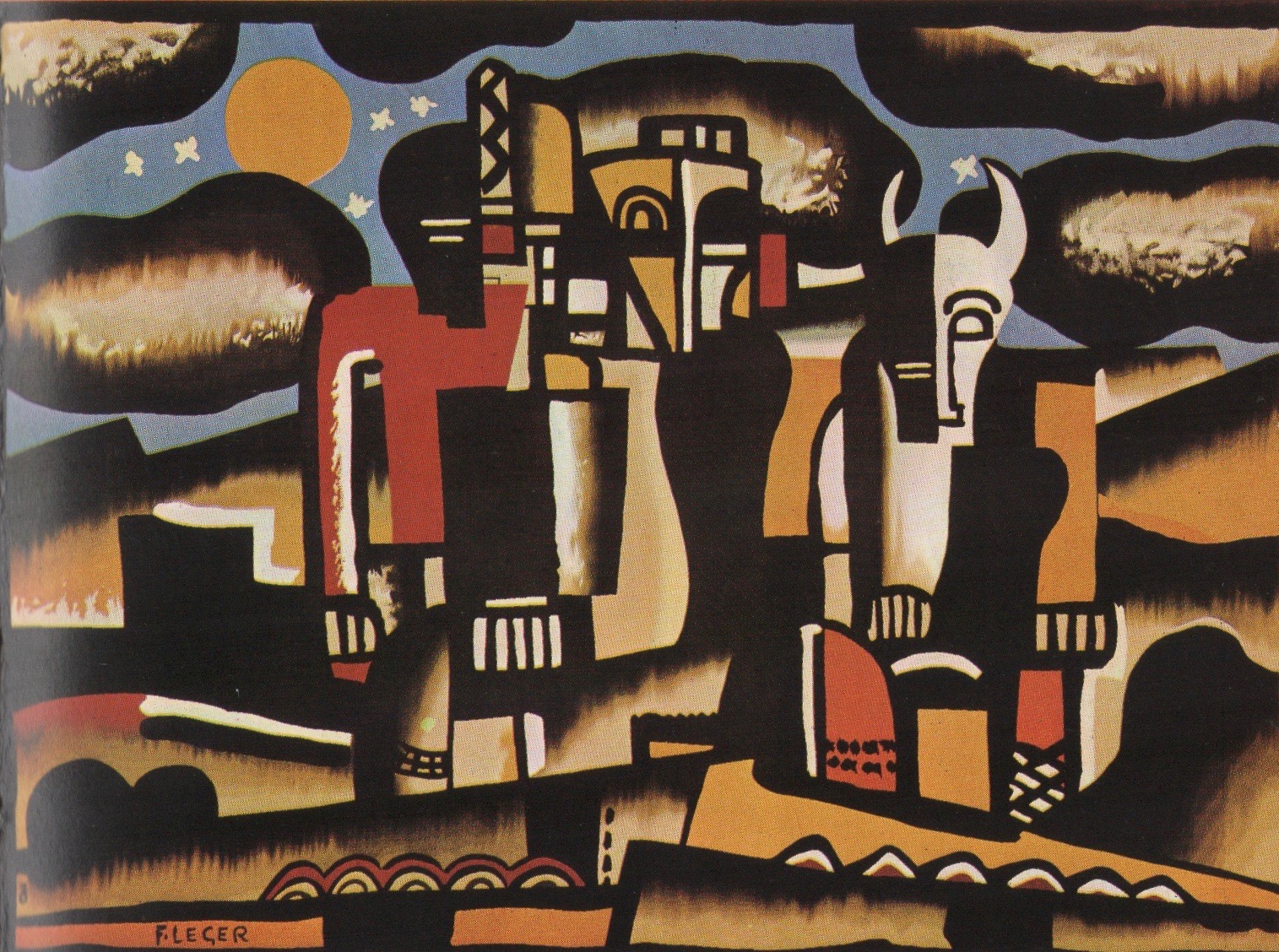
“The tapestry was woven after the design for the curtain of La Création du Monde, a ballet by Rolf de Maré for which Léger designed the scenery and costumes (1922).” This and other quoted material are from Brunhammer’s text.
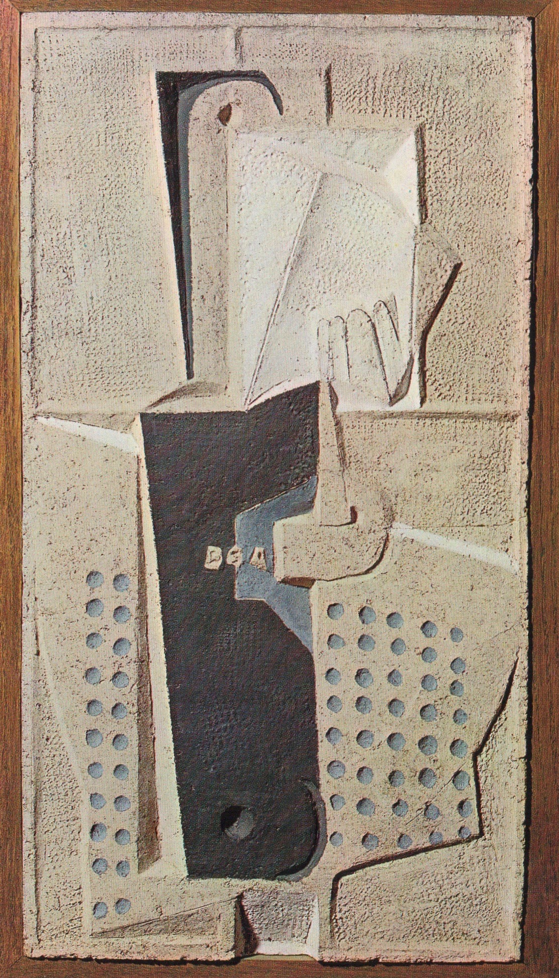
“This ‘operetta for dancing’ by Jean Cocteau and Darius Milhaud had scenery by Laurens and costumes by Chanel. It was perhaps the most successful of Diaghilev’s post-war experimental ballets.”
Le Train Bleu has appeared earlier here at SimanaitisSays
Art and Speed. The 1920s roared with speed, both on land and in the air. Brunhammer quotes Le Corbusier: “The great life of the machine has profoundly shaken society, has snapped all chains, opened all doors, and cast its eyes in every direction.”
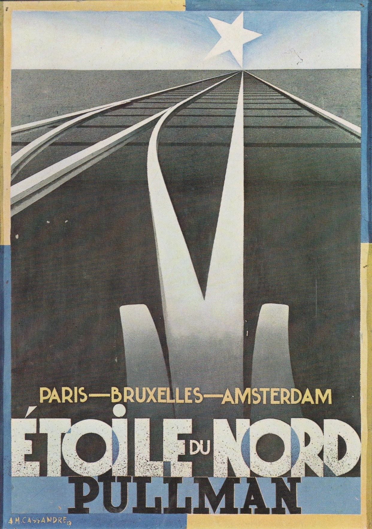
“With this poster, which permitted him to ‘insert the symbols of speed in the rhetoric of imagination’ (Delevoye), Cassandre created an advertising style derived from Cubism, in which the lettering played a part of the first importance.”
Art and Architecture. “The lesson of the machine was understood by the men who formed the Deutscher Werkbund and founded the Bauhaus (1919).” Indeed, others in Europe felt the same.
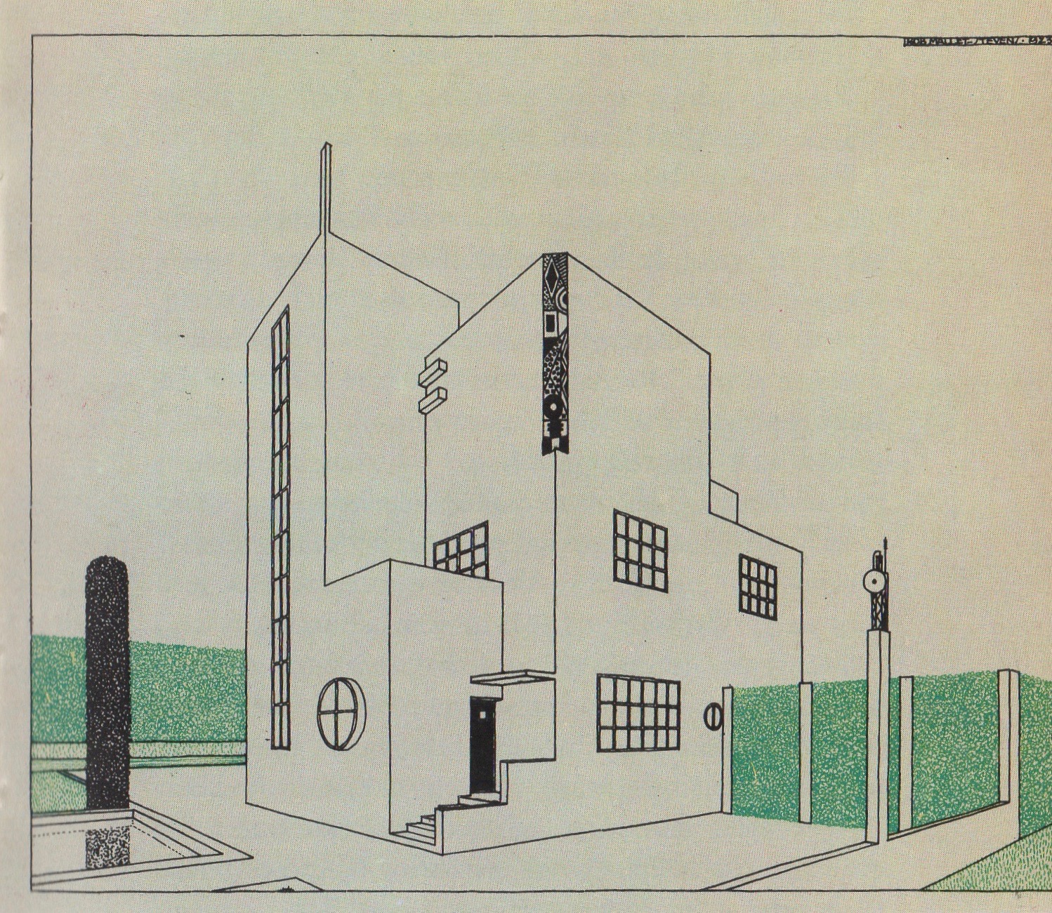
“The influence of Joseph Hoffman, the architect of the Palais Stoclet in Brussels, is apparent in this design. It heralded Mallet-Stevens’ future designs, notably the private mansions on the Paris street named after him.”
As I’ve noted before, being a mathematician I admire the rectilinearity of Bauhaus. These designs evoke this.
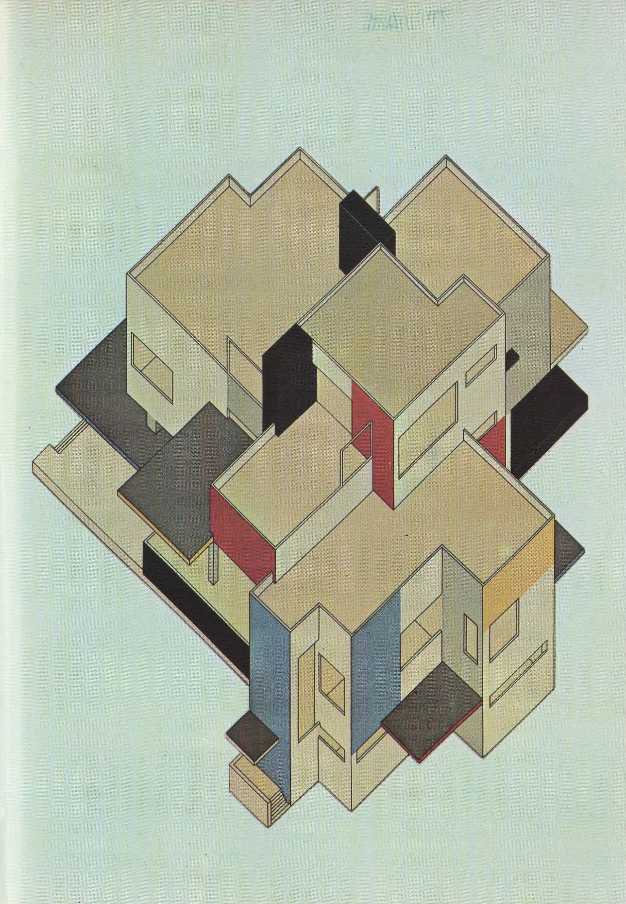
“Doesburg was the animating spirit of the De Stijl group. He and Van Eesteren have here given an outstanding example of how the three primary colours (red, blue, and yellow) and the three ‘non-colours’ of Neo-Plasticism (black, white, and grey) can be successfully combined in architecture.”
Tomorrow in Part 2, we’ll continue exploring 1920s’ style, even to a chair I’ve actually sat upon. ds
© Dennis Simanaitis, SimanaitisSays.com, 2022
