
Simanaitis Says
On cars, old, new and future; science & technology; vintage airplanes, computer flight simulation of them; Sherlockiana; our English language; travel; and other stuff
THE POWER OF GRAPHICS
GRAPHICAL REPRESENTATIONS can be potent means of sharing information. As examples, I share here several graphics accompanying “Inside Football’s Campaign to Save the Game,” The New York Times, November 7, 2019.
I stress that I have no particular dog in this fight. Indeed, I played high school football, with plenty of good memories—and no brain damage I’m told is all that evident. Yet I also read of serious problems associated with playing football, particularly at the brain-brusing intensity of the professional sport.
No, what struck me as interesting in this article was its use of marvelously effective graphics telling the story. I offer them here, with only a few comments of my own.
High School Football’s Popularity. Throughout the Midwest and particularly in Pennsylvania, for example, high school football significantly outranks other boys’ sports.
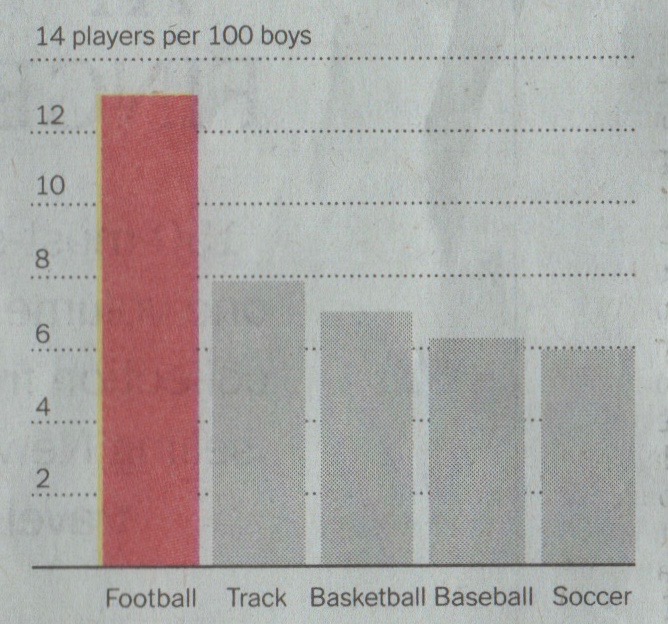
A straightforward bar graph assesses popularity. This and other graphics from The New York Times, November 10, 2019.
More than 12 percent of high school boys participate in football. Track is a distant second at less than 8 percent.
A Country-wide Trend, with an Outlier. With the exception of Pennsylvania, states have seen significant drops in high school football participation.
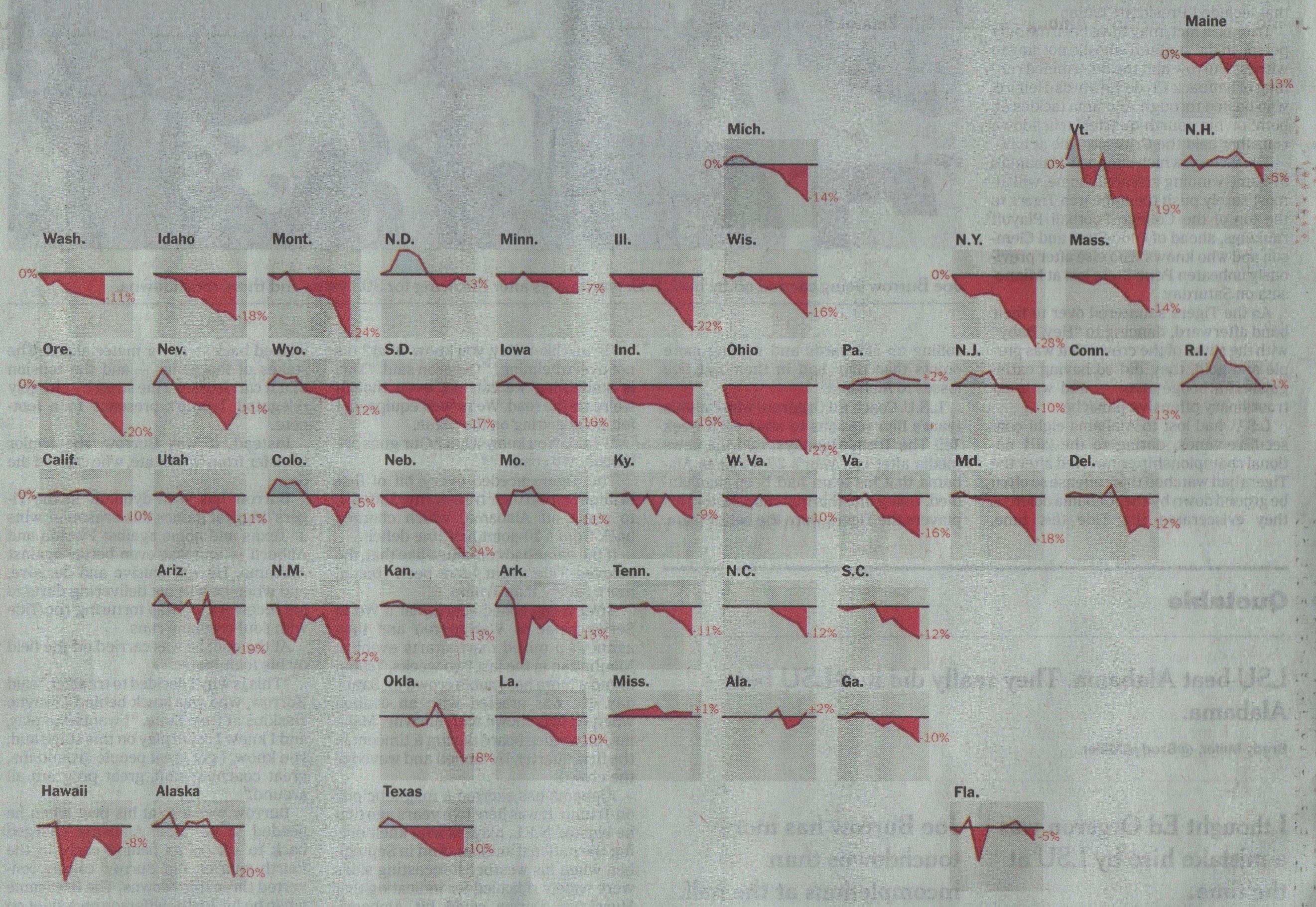
Percentage changes since 2009. Numbers adjusted for the number of boys enrolled in public school for each state. Source: National Federation of State High School Associations, National Center for Educational Statistics. Notice that the states’ arrangement in the graphic echoes their U.S. locations.
Outliers are easily identified, though the Times article offers no reason for Rhode Island’s peak, nor for New Hampshire’s lagging behind others in its decline. Curiously, Hawaii has shown some near-term growth in participation. And note how easy it is to identify the states most and least affected: They’re the most and least red.
How much easier this information is conveyed than if it were presented in mind-numbing numerical arrays!
Who Gets Injured, and How. High school football players sustain considerably more injuries than those in any other sport. Even hockey’s aggressive reputation is belied by the data.
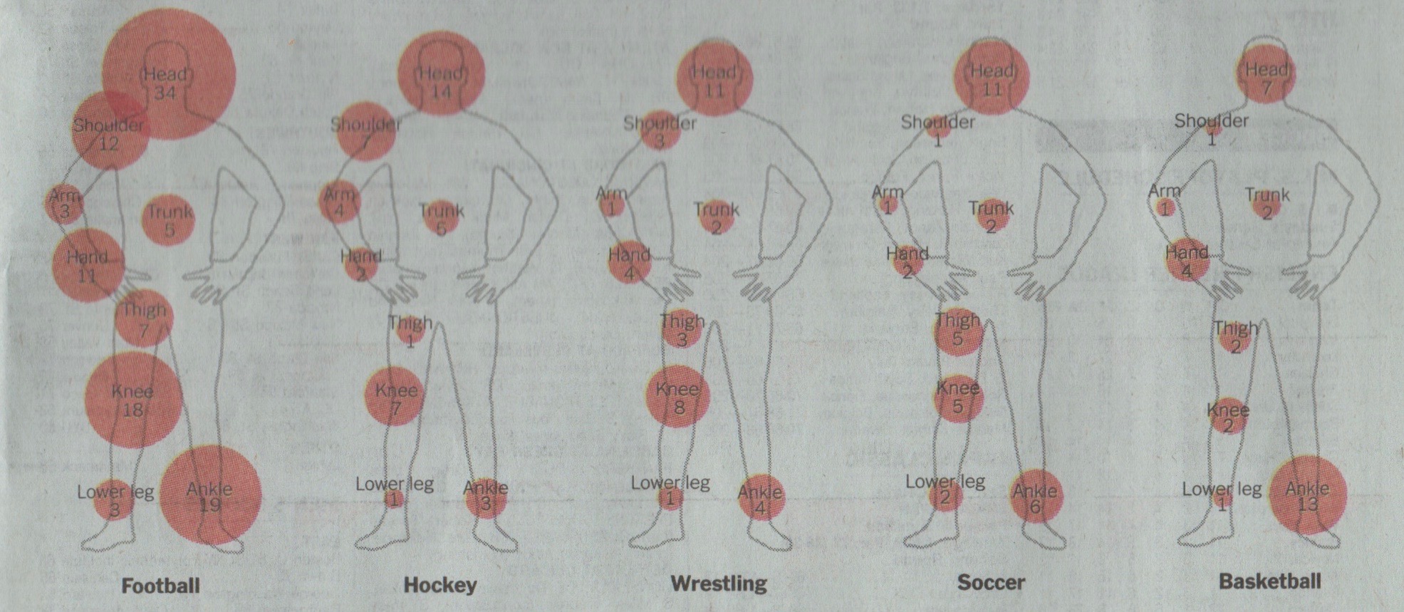
Common Injuries for Boys Among Popular High School Sports. Injuries per 10,000 competition plays. Source: National High School Sports-Related Injury Surveillance Study.
The idea of different-size circles representing values is an effective means of comparing data among groups. Notice how ankle injuries in basketball are easily confirmed as second only to those in football. Similarly for knees in wrestling.
Graphical Power. “A picture is worth a thousand words,” it has been said. One repost to this, wittily enough, is “Paint me the Gettysburg Address.” On the other hand, “Paint me what’s happening in high school football across the United States” can sure be portrayed in these few graphics. ds
Dennis Simanaitis, SimanaitisSays.com, 2019

We arties appreciate your appreciation!
🙂
Very interesting! This reminds me of the work of Edward Tufte, whose book was the first book acquired for our nascent graphic design program. I’m sure you heard of it and if not you will like it.