
Simanaitis Says
On cars, old, new and future; science & technology; vintage airplanes, computer flight simulation of them; Sherlockiana; our English language; travel; and other stuff
FROM VOLTAIRE TO FUTURA
THE LONDON REVIEW OF BOOKS CONTINUES TO OFFER erudite and entertaining Letters. To wit, its November 1, 2026, issue contains two that caught my eye: one about Voltaire, the other about the Futura type font.

In gleaning tidbits about both letters, I use quotes to identify reader comments; any comments of my own come id-free.
Monsieur Revol. Cheryl Sawyer, New South Wales, [Australia], writes, “Thomas Keymer speculates about the reasons for François-Marie Arouet’s choice of pen name, Voltaire (LRB, 24 September).”

Wikipedia expands, “Famous for his wit and his Criticisms of the Catholic Church and slavery, Voltaire was an advocate of freedom of speech, freedom of religion, and separation of church and state…. He was an outspoken advocate of civil liberties and was at constant risk from the strict censorship laws of the Catholic French monarchy. “
Gee, wouldn’t he be superb contrast to the likes of Trump and his Project 2025 mob.
As for his name, Wikipedia observes, “Arouet adopted the name Voltaire in 1718, following his incarceration at the Bastille. Its origin is unclear. It is an anagram AROVET LI, the Latinized spelling of his surname, Arouet, and the initial letters of le jeune (‘the young’). The name also reverses the syllables of Airvault, his family’s home town in the Poitou region…. Voltaire is known also to have used at least 178 separate pen names during his lifetime.”
Wikipedia continues, “Richard Holmes supports the anagrammatic derivation of the name, but adds that a writer such as Voltaire would have intended it to also convey connotations of speed and daring. These come from associations with words such as voltige (acrobatics on a trapeze or horse), volte-face (a spinning about to face one’s enemies), and volatile (originally, any winged creature). ‘Arouet’ was not a noble name fit for his growing reputation, especially given that name’s resonance with à rouer (‘to be beaten up’) and roué (‘a profligate person’).”
Reader Sawyer’s View. “I long ago reached my own conclusion and keep expecting it to pop up in a French or English journal, but it never has. The amusement in French word games often derives from shuffling syllables. If you remove the final ‘re’ from Voltaire and place it at the beginning, you arrive at ‘revoltai’.”
“Ai in French,” she continues, “is close to é in pronunciation, so by assigning the right accents you end up with révolté, ‘rebel’: an appropriate choice for Voltaire, who spent a lifetime rebelling against intolerance, injustice and ignorance. He was, paradoxically but of necessity, a persistent liar about his work and dropped many misleading clues about his name. On one occasion, wishing to keep secret a visit to Holland in 1736, he asked Émilie du Châtelet and his friends to write to him as Monsieur Revol.”
The Futura Font. Reader Bronaċ Ferran, London, writes, “Gill Partington notes that the Futura typeface was ‘initially adopted in the 1930s by the Nazi Party for its communications’ (LRB, 8 October). There’s more to the story.”
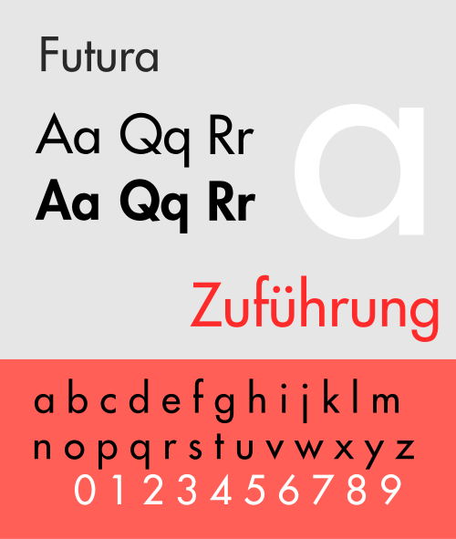
Futura. Image by Sherbyte from Wikipedia.
Wikipedia describes, “Futura is a geometric sans-serif typeface designed by Paul Renner and released in 1927. Designed as a contribution on the New Frankfurt-project, it is based on geometric shapes, especially the circle, similar in spirit to the Bauhaus design style of the period.”
See also “Comic Sans: A Typeface Getting No Respect” for another sans-serif fav of mine.
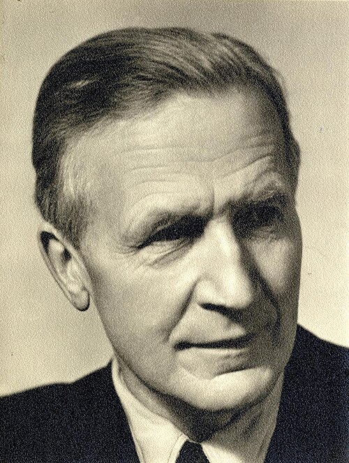
Paul Friedrich August Renner, 1878–1956, was a German typeface designer, author, and founder of the Master School for Germany’s Printers in Munich. Image by Eduard Wasow c. 1927 via Wikipedia.
Wikipedia notes that Renner “disliked abstract art and many forms of modern culture, such as jazz, cinema, and dancing. But equally, he admired the functionalist strain in modernism. Thus, Renner can be seen as a bridge between the traditional (19th century) and the modern (20th century). He attempted to fuse the Gothic and the roman typefaces.”
Reader Ferran describes, “The inventor of Futura, Paul Renner, went into ‘internal exile’ in Germany, having been arrested and dismissed from his post at the Master School for Printers in Munich, which he had founded, after publishing a long document in 1932 which spoke out against the Nazis and their antisemitism. His typeface, shaped to remove anomalies in the German language (it was initially produced without capital letters), was cast by the Bauer Type Foundry in 1927, and was open to everyone to use, whatever their political persuasion.”
A Restorative Action. Ferran continues, “Partington also mentions the typographer Hansjörg Mayer’s ‘decision to produce a whole series of experiments with Futura in 1965’. In this, Mayer, the leading small-press publisher in the concrete poetry movement, was building on the use of the typeface in the first poems published as concrete poems, in Brazil in the early 1950s, by the ‘noigandres’ group: Augusto and Haroldo de Campos and Décio Pignatari. Augusto de Campos recollected that they had adopted Futura as a restorative action, thinking of the interwar innovations disrupted and cut short by the displacements and horrors of the 1930s and 1940s.”
Renner’s Internationalism Fulfilled. “Between 1965 and 1968,” Ferran observes, “Mayer published a series of broadsheets titled ‘Futura’. These promoted the internationalism that Renner had in mind for the typeface, as well as its geometric affordances, which now appear so anticipatory of digital typefaces.”
It’s encouraging to read that a type font can possess such societal implications. ds
© Dennis Simanaitis, SimanaitisSays.com, 2026

