
Simanaitis Says
On cars, old, new and future; science & technology; vintage airplanes, computer flight simulation of them; Sherlockiana; our English language; travel; and other stuff
AND NOW FONTGATE!?!
WHAT WITH TRUMP SEEMINGLY COMMITTING WAR CRIMES in the Caribbean, Putin elbowing his way into Western Europe, unease still exising in Gaza and the West Bank, not to say health of the entire world being threatening by RFK Jr., you’d think our government would have better things to do than continue its retaliation against diversity, equality, and inclusiveness. Or even adding a letter to D.E.I.
Yet here’s the Secretary of State Marco Rubio—whom Trump usta call “Little Marco”— spending his time with Calibri, a mere typeface.
Michael Crowley and Hamed Aleaziz describe the matter in “At State Dept., A Typeface Falls Victim in the War Against Woke,” The New York Times, December 9, 2025. See also Yan Zhuang’s “Calibri’s Run-In With Rubio Wasn’t Its First Controversy,” The New York Times, December 11, 2025.
Also, having been something of a typeface aficionado for 46+ years, I include relevant SimanaitisSays articles: “A Typeface Getting No Respect,” October 18, 2019; “A Typeface Reconciliation Parts 1 and 2,” November 3-4, 2021; and “Fonts Can Save Trees,” April 29, 2024.
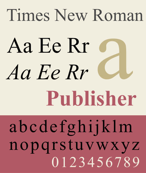
Above, Times New Roman (by the way, it originated in 1931 at the The Times (of London, not New York). Below, Source Sans 3. Images from Wikipedia.
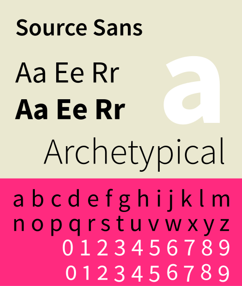
Federal Typefaces. Google’s AI Overview recounts, “Traditional federal government typefaces lean towards classic, legible serif fonts like Times New Roman (recently reinstated for State Dept. print) and sans-serifs like Source Sans Pro and the custom Public Sans for digital use, reflecting a mix of historical gravitas and modern screen readability, with specific agencies sometimes using others like Arial Black for logos.”
It also cites Cheltenham: “Used in the U.S. Congress for bills, resolutions, and legal texts, adding historical weight.”
And Then There’s Calibri. The Guardian asked, tongue-in-cheek, “Calibri: Is This Really the World’s Wokest Font?,” December 10, 2025. This is such wonderful satire, it’s offer here not just with selected tidbits, but in its entirely:
“It was the Windows typeface for 17 years—and adopted by the Biden administration for its readability for those with visual impairments. But Marco Rubio has ruled that Calibri lacks ‘decorum.’
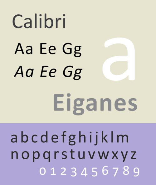
Image from Wikipedia.
Name: Calibri.
Age: 19.
Appearance: Woke.
Woke? Who is he/she? It’s not a person. It’s a typeface.
If you say so. You may know it from word processing warning boxes such as: ‘The font Calibri is missing. Your text might look different.’
I knew I’d heard of it, even if I have no idea what it looks like. It’s a sans-serif typeface designed by Lucas de Groot and first released with the Windows Vista operating system in 2006, along with a bunch of other new fonts beginning with C: Cambria, Candara, Consolas, Corbel. But Calibri subsequently became the default font for Microsoft Office.
Then I guess I do know what it looks like. It’s pretty unassuming, but Calibri is meant to be more readable than some fonts, and cause fewer issues with optical character recognition software.
You said it looked woke. Not me – US secretary of state Marco Rubio.
What’s he got to do with it? Back in 2023, the US state department switched from Times New Roman to Calibri for all its official documents, because Calibri was easier to read for people with certain visual disabilities, and it works better with assistive technologies including text-to-speech screen readers.
Makes sense. But in a department cable this week, Rubio ordered a switch back to Times New Roman.
Why? ‘To restore decorum and professionalism to the Department’s written work products and abolish yet another wasteful DEIA program,’ he wrote.
[“Accessibility” is another woke word?? Really, Little Marco??]
DEIA? Diversity, Equity, Inclusion and Accessibility – the four horsemen of wokery, as far as the Trump administration’s concerned.
So a professional and decorous document is one that visually impaired people can’t read? Serif typefaces like Times New Roman are ‘generally perceived to connote tradition, formality and ceremony,’ according to Rubio.
We really are losing the war on stupid. Perhaps you think official Trump administration documents should be printed in Comic Sans.
Comic Sans? The lighthearted comic book speech bubble typeface that proved so popular it ended up in all sorts of inappropriate places – including headstone inscriptions, domestic violence leaflets and second world war memorials. [And scads of Simanaitis technical presentations.]
I think people should use whatever font they like. They all have their uses – designers like Helvetica, publishers like Garamond, Trebuchet is good for digital media.
Is this the first time humble Calibri has made the news? No, it’s long played a role in solving crime and uncovering fraud.
How? Because of the specific year it was first offered – documents have been shown to be forgeries because they were printed in Calibri but dated before Calibri was available. [See also Yan Zhuang’s NYT piece above.]
Do say: “The font Calibri is missing.”
Don’t say: “Sorry, Secretary Rubio – I got your memo, but I couldn’t read it.’ ”
Thanks, Guardian; your wonderful essay looks fine too in SimanaitisSays’ Helvetica Neue (another sans-serif font, you’ll note). ds
© Dennis Simanaitis, SimanaitisSays.com, 2025

Wacko world…