Simanaitis Says
On cars, old, new and future; science & technology; vintage airplanes, computer flight simulation of them; Sherlockiana; our English language; travel; and other stuff
GIAMBATTISTA BODONI—”JUST THE TYPE”
MOLLY YOUNG WRITES ON X (formerly known as you-know-what), “Can’t help but think that ‘Bodoni’ sounds like Italian slang for ‘gorgeous big butt’— e.g. ‘Mamma mia, check out the bodoni on this one!’ ” Her essay “Just the Type,” in The New York Times Book Review, March 3, 2024, is in this entertaining vein, its subtitle “Walk into any bookshop and you’ll find that perhaps 10 percent of all book covers feature Bodoni.”

Bodoni fonts galore. Image by Tony Cenicola/The New York Times.
Here are tidbits about Bodoni, his typographical adventures, and legacy gleaned from Young’s article together with my usual Internet sleuthing.
A Family Tradition. Wikipedia notes of the family, Giambattista’s father and grandfather were both printers in Saluzzo [in the foothills of the Cottian Alps, in what was then Kingdom of Sardinia, and is now Piedmont], and as a child his toys were his grandfather’s leftover punches and matrices.”

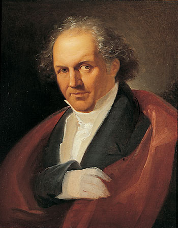
Giambattista Bodoni, 1740-1813, Italian typographer, compositor, printer and publisher. Portrait by Giuseppe Lucatelli from Wikipedia.
“He learned the printing trade working at his father’s side,” Wikipedia continues, “and his gift for wood-engraving and printing was evident very early. So was his ambition and liveliness. At the age of 17 he decided to travel to Rome with the intention of securing fame and fortune as a printer.”
Bodoni surely did. Molly Young recounts, “As a teenager he served an apprenticeship at the Propaganda Fide printing house in Rome, where he learned the sweaty skills of setting metal type. He then struck out on his own and wound up in Parma, where he lived and worked until his death in 1813.”
A Pilates Machine for an Ogre. Young visits the Museo Bodoniano in Parma: “A few steps into the museum stands a reproduction of Bodoni’s printing press. The contraption of cranks, planks and straps resembles an antique Pilates reformer machine built on the scale of an ogre. It implies the hard labor involved in typecasting: the stamping, hammering and punching; the handling of molten metal and the proximity of blasting furnaces.”

“Bodoni’s elegant craft required some brutal, fearsome tools.” This and the following image by Molly Young.
Young observes, “Vitrines at the museum feature Bodoni’s anvils, hooks, blades, clamps, awls, calipers, files and pliers. These instruments of glinting steel bring to mind the lair of a cinematic serial killer. Happily, they were used for the higher purpose of creating standardized, aesthetically pleasing and instantly legible characters. (That said, one trait Bodoni could be said to share with movie serial killers was, per a placard, ‘una maniacale attenzione per ogni fase del lavoro,’ or ‘a maniacal attention to detail.’)”

Pop Star Celebrity. Young writes, “By middle age Bodoni achieved the kind of celebrity we now associate with pop stars and presidents. Aristocrats sang his praises. He hung out with the pope. Benjamin Franklin developed a long-distance obsession with one of his printing manuals. Napoleon was a fan.”
Indeed, Wikipedia notes, “On his trip to Paris to crown Napoleon emperor, Pope Pius VII had been impressed by a copy of Jean-Joseph Marcel’s ‘Oratio Dominica,’ which contained the Lord’s Prayer in 150 languages. Visiting Bodoni on his way back to Rome, he challenged him to surpass the Frenchman’s achievement. Bodoni took up the challenge, and in 1806 he was able to present the Pope with an ‘Oratio Dominica’ in 155 languages.”
“Before his death on 30 November 1813, Bodoni had started work on a series of French classics for his new patron, Joachim Murat, Napoleon’s brother-in-law. The ‘Théatre Complet de Jean Racine’ was on the press on the day of his death. His favorite title page was the one for ‘Boileau Despréaux.’ ”

Title page for Boileau Despréaux. Image from Wikipedia.
Bodoni Style. Wikipedia says, “Bodoni had a long career and his designs changed and varied, ending with a typeface of a slightly condensed underlying structure with flat, unbracketed serifs, extreme contrast between thick and thin strokes, and an overall geometric construction…. In the English-speaking world, ‘modern’ serif designs like Bodoni are most commonly used in headings and display uses and in upmarket magazine printing, which is often done on high-gloss paper that retains and sets off the crisp detail of the fine strokes. In Europe, they are more often used in body text.”

Facsimile of lines from Dante’s “La Vita Nuova” first published with Bodoni types by the Officina Bodoni in 1925. Actual font is the digital Bodoni Monotype published in 1999. Image by James Arboghast from Wikipedia.
Young observes, “With its straight hairline serifs and high degree of contrast between thick and thin strokes, Bodoni has an elegant literary appearance. It has inspired countless riffs and copies. A graphic designer seeking shorthand for ‘sophisticated’ might reach for Bodoni or one of its relatives.”
She continues, “The typeface was also one of six preferred by the legendary graphic designer Massimo Vignelli, most famous for designing the visual system of the New York City subway in the 1970s. “Wikipedia notes, “Massimo Vignelli stated that ‘Bodoni is one of the most elegant typefaces ever designed.’ ”
I must confess that elegance in typography is somewhat out of my ken: See my celebration of Comic Sans Serif “A Typeface Getting No Respect.” But I sure enjoyed Molly Young’s Bodoni essay. ds
© Dennis Simanaitis, SimanaitisSays.com, 2024

“giambati Ista” sound like something Trump would say when his brain goes numb.John